Art & Photography Book Printing
ICC-profiled color calibration on archival coated stock, Smyth-sewn binding that opens flat to a full spread, and custom trims from 6 × 9 to 12 × 14 — printed for the format where the reproduction is the product.
Built for How Visual Work Is Actually Reproduced
ICC-Profiled Color Management
We build a press profile for your specific paper stock and calibrate ink density, dot gain, and color balance to that profile at the start of every art book run. The proof you approve is produced under the same conditions as the production run.
Archival Coated Stock
Acid-free, lignin-free coated papers that resist yellowing, foxing, and image degradation. An art book produced on archival stock will reproduce the work faithfully decades from now, not just the day it ships.
Custom and Oversized Trims
Standard portrait, landscape, and square trims from 6 × 9 to 12 × 14 inches. Custom dimensions available. The trim is part of the design — it sets the scale and proportion of every image in the book.
Smyth-Sewn Flat-Opening Binding
Full-spread images demand binding that opens flat. Smyth sewing is non-negotiable for art books with two-page spreads — it lets the pages lie open without curvature, gutter shadow, or image loss at the spine.
Who This Page Is For
This page is for visual artists, photographers, illustrators, galleries, museums, curators, art publishers, exhibition organizers, and self-publishing artists producing monographs, exhibition catalogs, portfolio books, artist retrospectives, and limited-edition art objects in runs of 25 to 5,000 copies. Whether you are printing a photographer’s monograph for gallery distribution, an exhibition catalog for a museum show, an illustration portfolio to sell at conventions and through your website, a limited-edition artist book with tip-ins and special finishes, or a career retrospective collecting decades of work, the production guidance here applies.
Art and photography book printing is the most color-critical category in the entire printing industry. In every other genre, the printed content serves the text — the reader is absorbing ideas, following a story, referencing data. In art books, the printed reproduction IS the content. A color shift that would be invisible in a cookbook is unacceptable in a photography monograph. A binding that is adequate for a novel is inadequate for a book where two-page spreads are primary compositions. A paper surface that is interchangeable for business books is a fundamental artistic decision for an art book.
This page explains what actually changes in manufacturing when you print art and photography books, where color reproduction fails, and how to spec the project so the printed book faithfully represents the work.
What Changes in Production for Art and Photography Books
Art book production differs from other full-color book printing in the level of precision required at every stage. The color management is tighter. The paper selection has artistic implications beyond cost and durability. The binding must accommodate flat-opening spreads with zero gutter compromise. The trim size is a design decision, not a convention. And the proofing process requires physical verification — screen proofing is insufficient for work where color accuracy is the primary quality criterion.
Color Management: From File to Press Sheet
Color management in art book printing is a chain of controlled translations — from the artist’s file to the screen, from the screen to the proof, from the proof to the press. Every link in the chain introduces a translation, and every translation can introduce error. The goal is to minimize cumulative error so the final press sheet reproduces the artist’s intention.
The fundamental problem. The artist creates or captures work that exists in a specific color space — typically Adobe RGB or ProPhoto RGB for photographers, or the native color space of the capture device (camera, scanner, digital painting application). The press reproduces the work in CMYK on paper. The CMYK gamut is smaller than any RGB gamut, which means some colors in the original file cannot be reproduced at the same intensity. The question is not whether gamut compression occurs — it always does — but how it is managed.
Generic vs. profiled conversion. A generic CMYK conversion applies a one-size-fits-all mapping from RGB to CMYK. It works acceptably for commercial printing where absolute color accuracy is not the primary concern. For art books, it is insufficient. A profiled conversion uses an ICC output profile that describes the exact behavior of our press with your specific paper stock — how much ink the paper absorbs, how dot gain affects midtones, how the coated surface reflects light. The profile maps the RGB values in your file to CMYK values that, when printed on your paper under our press conditions, produce the closest possible match to the original.
Press calibration. The profile is only accurate if the press is calibrated to the conditions the profile was built under. At the start of every art book run, we calibrate ink density, dot gain, and color balance to the target values specified by the output profile. We verify calibration by printing a control strip on the first press sheets and measuring it with a spectrophotometer. If any values have drifted (ink temperature, roller pressure, humidity — all affect color), we adjust before the production run begins.
Press proof verification. The physical press proof is produced under the same conditions as the production run — same press, same paper, same ink, same profile. The proof you approve is not a simulation of what the book will look like; it is a sample of what the book will look like, produced on the actual materials. For art books, this is the only acceptable proofing method. Digital soft proofs (on-screen PDFs) are useful for layout and typography review but are unreliable for color evaluation because the screen introduces its own rendering variables.
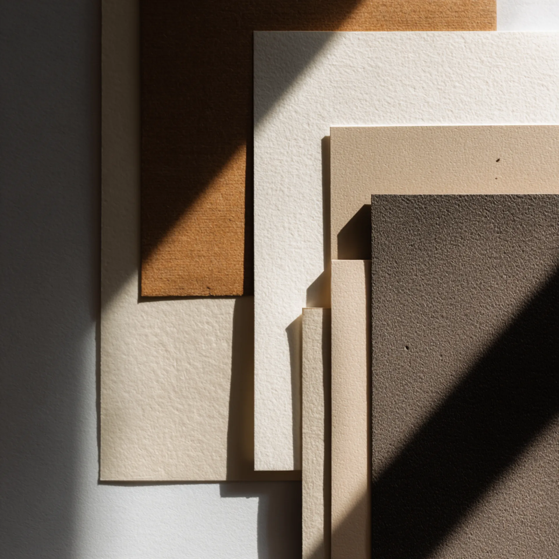
Paper Selection as an Artistic Decision
In most book printing, paper selection is a production decision — what weight, what opacity, what cost. In art book printing, paper selection is an artistic decision that fundamentally affects how the work appears. The same photograph printed on gloss coated, matte coated, silk coated, and uncoated archival stock will look like four different images. The paper does not just carry the image; it interprets it.
Gloss coated (80lb–130lb). The highest color saturation, the deepest blacks (D-max), and the sharpest perceived detail of any paper surface. Gloss achieves this because specular reflection from the coated surface intensifies color perception — the eye perceives reflected light as more saturated. Gloss is the standard for high-color photography, vivid illustration, and any work where maximum visual impact is the goal. The tradeoff: glare under direct lighting, a “commercial” rather than “fine art” feel, and fingerprint visibility on the surface.
Matte coated (80lb–130lb). Lower saturation and a reduced black density compared to gloss, but a softer, more contemplative visual quality. Matte paper scatters light rather than reflecting it directionally, which reduces glare and produces an image that feels quieter, more introspective. Matte is preferred for black-and-white photography, documentary work, muted-palette art, and projects where the book should feel editorial or literary. The tradeoff: blacks are not as deep (maximum density on matte is lower than on gloss), and very dark images can lose shadow detail.
Silk (satin) coated (80lb–130lb). A moderate sheen — less reflective than gloss, more reflective than matte. Good color saturation, minimal glare, and a surface that balances visual impact with readability. Silk is increasingly the default for photography and art books because it delivers most of the color performance of gloss without the glare and fingerprint issues.
Uncoated archival. Ink absorbs into the paper fiber rather than sitting on a coated surface. The result is a softer, lower-contrast image with a distinctly fine-art quality — the print feels more like a lithograph or a letterpress print than a commercial reproduction. Uncoated stock is used deliberately in art books to evoke fine-art printing traditions. It is not appropriate for work that depends on color saturation or photographic sharpness, but it is the right choice for certain artistic intentions.
Weight and feel. Art books often use heavier interior stock than standard books — 100lb or 130lb — because the page feel is part of the product experience. A thick, rigid page that does not flex when turned communicates quality and physicality. Heavier stock also reduces show-through (ghosting of the image on the reverse side through the page), which is important for art books where facing pages may show unrelated images.
We stock all of these options in archival grades (acid-free, lignin-free) and can send samples with your test images printed on each surface. For art books, we strongly recommend ordering samples before committing to a stock — the paper choice affects the entire character of the book, and it should be evaluated with the actual images, not in the abstract.
Binding for Full-Spread Image Presentations
Art books are designed around the spread — the two-page open view. Spread compositions, image sequencing across facing pages, and the rhythm of turning pages are fundamental to the artistic experience of the book. The binding must support this by opening flat enough that the gutter does not compromise the image.
Smyth-sewn case binding. The standard for art and photography books. Smyth sewing stitches the signatures with thread, allowing the spine to flex and the pages to open nearly flat. Gutter loss is minimal — approximately 0.125–0.25 inches per side. For images that cross the gutter (full-spread photographs), this is the best bound-book option. Smyth-sewn art books can be opened repeatedly to the same spread without spine degradation.
Lay-flat binding. For art books where full spreads are the primary presentation format — where every image spans two pages with zero gutter loss — lay-flat binding is the correct choice. Each sheet is individually bound with flexible adhesive, and the pages open completely flat. The result is a seamless spread with no curvature, no gutter shadow, and no image loss. Lay-flat is more expensive per unit than Smyth sewing because every page is an individual sheet, but for spread-intensive art books, it produces a dramatically superior result.
Section sewing (Japanese stab binding, coptic binding). Exposed-spine binding methods used in artist books, limited editions, and conceptual publications. The binding itself is a design element — visible stitching, exposed spine structure, and a handmade quality that signals craft. These methods open flat and allow the book to be displayed open as an object. They are labor-intensive and appropriate for small-run editions (25–200 copies).
PUR perfect binding. Acceptable for art books where the content is primarily single-page images (each image occupies one page, no spreads cross the gutter). PUR is significantly cheaper than Smyth sewing and produces a clean spine. But it does not open flat, and images near the gutter will curve into the binding. Not recommended for spread-dependent art books.
Custom and Oversized Trim Sizes
Art book trim size is a design decision that affects how every image in the book is perceived. A 6 × 9 book reproduces a landscape photograph at roughly 5.5 × 8 inches — a modest scale that works for text-heavy publications but undersells large-scale visual work. A 10 × 12 book reproduces the same photograph at roughly 9.5 × 11.5 inches — a scale that approaches the impact of a gallery print.
Standard trims we stock: 8.5 × 11 (portrait), 9 × 12 (portrait), 10 × 10 (square), 11 × 11 (square), 10 × 12 (portrait), 12 × 12 (square). Landscape orientations available at all sizes.
Custom trims up to approximately 12 × 14 inches. Beyond that dimension, the press sheet size limits production. For truly oversized books, we can advise on alternative production methods.
Trim and image scale. The trim determines the maximum image reproduction size. For photographs that are the focal content (monographs, portfolio books), the largest trim you can afford and produce economically generally delivers the best result. For exhibition catalogs that mix images with substantial text (essays, artist statements, plate descriptions), a moderate trim (8.5 × 11 or 9 × 12) balances image scale with text readability.
Oversized production considerations. Trims above 10 × 12 increase per-unit cost because more paper is consumed per page, press sheet waste increases on non-standard dimensions, and the bindery handles each book individually rather than in batch. Oversized books are also heavier, which increases shipping cost per unit. These are standard tradeoffs for the category — art books at 10 × 12 and above are premium products priced accordingly.
Typical Specs for Art and Photography Books
Photography Monograph
| Spec | Recommended | Notes |
|---|---|---|
| Trim size | 10 × 12 in, 9 × 12 in, or 11 × 11 in (square) | Scale should serve the images; landscape orientation common for landscape photography |
| Binding | Smyth-sewn case bound | Lay-flat for monographs designed entirely around full spreads |
| Interior paper | 100lb or 130lb gloss, matte, or silk coated, archival | Paper surface is an artistic choice — order samples with your images before committing |
| Cover | Printed case wrap or cloth with foil | Dust jacket with matte or soft-touch lamination; some monographs use a printed case without dust jacket |
| Interior color | Full CMYK throughout | ICC-profiled color management |
| Page count | 80–200 pages | Monographs tend to be shorter than text-heavy books; each page is a plate |
| Extras | Tip-in plates, printed endsheets, ribbon marker | Tip-ins for special plates on a different stock; printed endsheets with supplementary images or a portrait of the artist |
Exhibition Catalog
| Spec | Recommended | Notes |
|---|---|---|
| Trim size | 8.5 × 11 in or 9 × 12 in | Must accommodate both plates and essay text comfortably |
| Binding | Smyth-sewn case bound (hardcover) or Otabind softcover | Hardcover for museum shops and institutional archives; softcover for broader distribution and lower price point |
| Interior paper | 100lb matte or silk coated, archival | Matte or silk preferred for catalogs that include substantial text (essays read more comfortably on non-gloss surfaces) |
| Cover | Softcover with matte lamination or hardcover with printed case | Exhibition title, key image, and institution name/logo |
| Interior color | Full CMYK throughout | Plates and text pages on the same stock |
| Page count | 80–300 pages | Varies with the number of works and the volume of critical writing |
Artist Portfolio / Illustration Book
| Spec | Recommended | Notes |
|---|---|---|
| Trim size | 8.5 × 11 in, 10 × 10 in, or custom | Square formats popular for illustration portfolios |
| Binding | Smyth-sewn case bound or PUR perfect bound softcover | Hardcover for premium portfolios; softcover for convention sales and broader distribution |
| Interior paper | 80lb or 100lb matte or silk coated | Silk is a strong default for illustration — good saturation without the glare of gloss |
| Cover | Printed wrap with matte or soft-touch lamination | Feature a signature image or a typographic design; foil on the title for premium editions |
| Interior color | Full CMYK throughout | |
| Page count | 48–150 pages | Portfolios are typically shorter; each page is a showcase |
Limited / Collector Edition
| Spec | Recommended | Notes |
|---|---|---|
| Trim size | Custom or oversized | The edition format should be distinct from any trade edition |
| Binding | Smyth-sewn case bound, lay-flat, or exposed-spine sewing | Binding choice is a design element |
| Interior paper | 130lb coated or uncoated archival | Heavier stock signals rarity and quality |
| Cover | Cloth, leather-look, or specialty material with foil and/or debossing | No dust jacket — the case is the cover design |
| Extras | Tip-in plates, signed/numbered colophon, slipcase, printed endsheets | Each element adds production cost but creates value in the limited-edition market |
| Run size | 25–500 copies | Numbered and/or signed; edition statement on colophon page |
Common Mistakes We See
- Files submitted in sRGB instead of Adobe RGB or ProPhoto RGB. sRGB is the smallest standard RGB color space — it clips colors that Adobe RGB and ProPhoto RGB preserve. If the original capture or artwork is in a wider gamut, converting to sRGB before submission permanently discards color data. Submit in the widest gamut available. We convert to CMYK from that starting point.
- No physical press proof ordered. Screen proofing is unreliable for art books. The gamut difference between RGB and CMYK, the paper surface effect on color perception, and the dot gain on the specific stock all compound into a visible difference between screen and print. A physical proof on the production stock is the only reliable color verification method. Skipping it is the single most common cause of artist dissatisfaction with the printed result.
- Paper stock chosen without seeing a printed sample. The same image looks fundamentally different on gloss, matte, silk, and uncoated paper. Choosing paper from a description or a swatch without seeing your actual images printed on the stock is choosing blind. We provide printed samples on request.
- Full-spread images designed without gutter allowance. Even Smyth-sewn binding consumes 0.125–0.25 inches per side at the gutter. An image designed to cross the spread must account for this loss. Critical details (faces, fine text, compositional focal points) placed at the center of a spread will be partially obscured. If gutter loss is unacceptable for the work, lay-flat binding eliminates it.
- Images at 200–250 DPI. 300 DPI at the final printed size is the minimum for art book reproduction. At 200 DPI on large-format trims, softness is visible — fine detail blurs, edges lose definition, and textures lose resolution. For line art (engravings, pen illustrations), 600–1200 DPI is required.
- Black-and-white photographs submitted as RGB. B&W photos in an RGB file can pick up a subtle color cast during CMYK conversion — a warm or cool tint that is invisible on screen but noticeable in print alongside other B&W images. Submit B&W photographs as grayscale files (not RGB desaturated to gray) to prevent unwanted tinting.
- Cover image over-saturated to compensate for lamination. Artists sometimes increase saturation in the cover file because they expect lamination to dull the color. Matte lamination does desaturate slightly, but gloss lamination does not — and an over-saturated file under gloss lamination produces an unnaturally vivid result. Do not compensate in the file. Request a lamination proof instead.
Preflight Checklist
Before submitting files for an art or photography book:
- All files in CMYK (artist-converted with appropriate profile) or wide-gamut RGB (Adobe RGB or ProPhoto RGB) for our prepress conversion
- Color space tagged in the file (embedded ICC profile) — do not strip the profile
- All images at 300 DPI minimum at final printed size; line art at 600–1200 DPI
- B&W photographs submitted as grayscale, not desaturated RGB
- Interior PDF is single-page (not reader spreads), pages in sequential order
- Cover PDF includes 0.125” bleed on all sides; spine width matches our template
- Full-bleed images include 0.125” bleed on all trimmed edges
- Full-spread images designed with gutter clear zone appropriate for binding method
- Total ink coverage does not exceed 320% on any page (art books may use higher coverage than standard books — confirm with our prepress team)
- For hardcovers: endsheet art includes safe zones at the hinge fold
- For tip-in pages: tip-in files submitted as separate PDFs with stock and placement specified
- Physical press proof ordered (strongly recommended for all art book projects)
- ISBN barcode on back cover for retail distribution
How an Art Book Project Moves Through Production
1. File Intake, Spec Confirmation, and Paper Selection
You submit interior, cover, and finishing element files through our upload portal. We confirm trim size, paper stock and surface finish, binding method, cover material, and quantity.
Genre-specific checkpoint: We verify the color space and embedded ICC profile of every file. We confirm the paper stock selection — if you have not tested the stock with your images, we recommend ordering printed samples before production begins. For custom or oversized trims, we confirm the dimensions fit within our press sheet capacity and advise on any production constraints. For limited editions with tip-ins, slipcases, or specialty materials, we confirm every component and its placement.
2. Color Management and Proofing
This is the most critical stage in art book production. Our prepress team applies the ICC output profile for your chosen paper stock, converts any RGB files to CMYK using that profile, and prepares the press sheets with color control strips for calibration verification.
You receive a digital proof for layout and typography review. For color verification, we produce a physical press proof on your actual paper stock. The proof is printed on our press under calibrated conditions — the same ink, the same paper, the same dot gain compensation. For monographs and limited editions, we recommend reviewing the proof alongside the original artwork or reference prints in controlled lighting (daylight-balanced, D50).
The proof review process for art books is not optional. It is the production step that determines whether the printed book accurately represents the work.
Genre-specific risks: Gamut compression producing visible color shifts on out-of-gamut colors (neon greens, electric blues, deep violets). Dot gain darkening midtones on matte stock. Black-and-white images picking up a color tint from CMYK conversion. Shadow detail loss on dark images printed on matte paper (matte has a lower maximum density than gloss).
3. Printing
Art book interiors are full-color on coated stock with the same drying and set-off management as cookbooks and graphic novels, plus the additional requirement of press-side color monitoring throughout the run. We verify color against the approved proof at intervals during printing — not just at the start — to ensure consistency from the first sheet to the last.
For limited editions and critical projects, we offer press checks — the artist or their representative is present (in person or via real-time video) during the press run to approve color on the first sheets and verify consistency throughout.
4. Binding and Finishing
Smyth-sewn hardcovers: Signatures are sewn, endsheets tipped, text block cased in, and pressed. Dust jackets printed and applied. Tip-ins hand-applied after the text block is assembled. Turnaround is 18–25 business days from proof approval (longer for oversized books and editions with tip-ins or specialty finishing).
Lay-flat binding: Individual sheets bound with flexible adhesive. Turnaround is 15–20 business days.
Softcovers (Otabind or PUR): 12–15 business days.
Genre-specific risks:
- Tip-in alignment. Tip-in pages must be positioned precisely on the host page. Misaligned tip-ins look careless. We position each tip-in with a jig for consistent placement across the run.
- Oversized book handling. Large-format art books (10 × 12 and above) require individual handling during finishing — the sheets are too large for standard bindery equipment. This adds production time and per-unit cost.
- Slipcase fit. If the edition includes a slipcase, the slipcase dimensions must account for the actual finished book size (including case board thickness, endsheet bulk, and any dust jacket). We build slipcases to measured dimensions after the first bound book is produced.
5. Packaging and Fulfillment
Art books are packaged for protection. Hardcovers are individually wrapped. Slipcased editions are packed with the book inside the slipcase, then wrapped. Limited editions may include additional protective packaging (tissue, foam inserts) to prevent surface damage during transit.
We ship to your address, your gallery, your distributor, or multiple locations. For exhibition catalogs timed to a gallery opening, we ship directly to the gallery or museum and recommend building in 5–7 business days of buffer beyond the standard production timeline.
Design and File Preparation
Color Workflow for Artists and Photographers
The file preparation process for art books is more demanding than for any other category. The files you submit must be color-accurate, properly profiled, and at sufficient resolution to reproduce your work at the printed scale.
Working color space. Capture and edit in the widest gamut available — Adobe RGB 1998 for photographers, ProPhoto RGB for fine-art digital work. Do not convert to sRGB at any point in the workflow. sRGB clips colors that wider gamuts preserve, and the clipped data cannot be recovered.
Soft proofing. Before submitting files, soft proof them on a calibrated monitor using our output ICC profile (available on request). Soft proofing simulates the CMYK gamut and the paper surface effect, giving you a preview of how the conversion will look. This is not a substitute for a physical proof, but it identifies the most significant gamut compression issues before you commit to a proof cycle.
CMYK conversion. If you convert to CMYK yourself, use our output ICC profile or a profile for the paper surface category (gloss coated, matte coated). Use perceptual rendering intent for photographic images (it compresses the gamut smoothly) and relative colorimetric for graphic artwork with specific brand colors. If you prefer, submit wide-gamut RGB and let our prepress team handle the conversion.
Black-and-white photography. Convert B&W images to grayscale mode, not desaturated RGB. A grayscale file prints in black ink only. A desaturated RGB file is converted to CMYK and prints with all four inks, which can introduce a visible color tint — warm or cool depending on the conversion profile. If you intentionally want a toned B&W (warm tone, selenium tone, cool tone), build the tone in the file and submit as CMYK or RGB with a note specifying the intended tone.
Image Sequencing and Book Design
Art book design is not layout in the conventional sense — it is sequencing, pacing, and spatial composition. The order of images, the rhythm of single-page plates and full spreads, the placement of text, and the use of blank space all contribute to the reader’s experience of the work.
Production-relevant design considerations:
- Spread design. Design full spreads (images crossing the gutter) with a clear zone at the center — 0.25” per side for Smyth-sewn, 0” for lay-flat. Critical content (faces, compositional focal points) should not fall in the gutter.
- Facing page pairs. Even when images do not cross the gutter, the facing pages are seen together. Consider tonal balance, color temperature, and compositional direction of facing images — a dark image facing a bright one creates a visual imbalance that is more pronounced in print than on screen.
- Blank pages. Blank pages are a design tool in art books, not a production error. A blank page before a major image creates visual breathing room and focuses attention. Blank pages count toward the page total and affect spine width.
- Text placement. Artist statements, essays, plate descriptions, and colophon text should be set in a typeface and size that is readable but subordinate to the images. The text supports the visual work, not the reverse.
Spec Downloads and Tools
We provide production tools designed for art and photography book workflows:
- Cover template generator — Enter your page count, interior stock (with caliper for coated and uncoated options), and get a cover template with exact spine width. Available for standard and custom trims. PDF and Adobe Illustrator formats.
- Spine width calculator (coated stock and heavy-stock mode) — Calculate spine width for 80lb, 100lb, and 130lb coated stocks with accurate caliper data.
- ICC output profiles — Download our press output profiles for the paper stocks we carry. Use these for soft proofing on a calibrated monitor and for CMYK conversion in your own workflow.
- Color workflow guide for art books — Recommended working color spaces, CMYK conversion settings, rendering intents, soft proofing procedure, and B&W workflow for grayscale and toned prints.
- Spread gutter guide — Visual reference showing gutter loss for each binding method (Smyth-sewn, lay-flat, PUR), with overlay templates for your spread layouts.
- Paper sample kit with printed images — Request physical samples of our coated stocks (gloss, matte, silk) in multiple weights, with a standard test image printed on each so you can evaluate the surface effect on color and detail.
These tools are available in our Resources section. Artists and designers who work with our ICC profiles and templates produce files that translate more accurately to press, which reduces proof revision cycles and accelerates production.
Trust Signals
Production volume: Origin Books prints photography monographs, exhibition catalogs, illustration portfolios, artist retrospectives, and limited-edition art objects for photographers, visual artists, galleries, museums, art publishers, and self-publishing artists. Our art book production ranges from 25-copy signed limited editions to 5,000-copy exhibition catalogs with institutional distribution.
Color management. ICC-profiled press calibration for every art book run. Spectrophotometer-verified ink density and color balance at press setup. Physical press proofs on production stock. Press-side color monitoring throughout the run. For critical projects, we offer in-person or video press checks.
Paper range. We stock archival-grade coated papers in gloss, matte, and silk finishes at 80lb, 100lb, and 130lb weights — plus uncoated archival stocks for fine-art applications. All art book stocks are acid-free and lignin-free.
Bindery capability. Smyth-sewn case binding, lay-flat binding, Otabind, tip-in application, foil stamping, debossing, slipcase construction, and oversized book handling — all in-house. We control the entire production chain from press to bindery to packaging.
Custom trim capability. Standard, landscape, square, and custom trims up to approximately 12 × 14 inches. Oversized art books require specialized handling at every production stage — printing, folding, binding, and packaging — and we manage all of it in our facility.
For the full selection of paper options, binding methods, and finishing techniques, see Paper and Materials and Binding Options.
Next Steps
Ready to print? Request a quote with your trim size, page count, interior stock preference, binding method, and quantity. For custom trims or limited editions with specialty finishing, describe the full spec and we will quote as a single production project.
Want to see your work on the paper? Request a printed paper sample kit with your test images on gloss, matte, and silk coated stock. This is the most important pre-production step for an art book.
Need ICC profiles? Download our output profiles for soft proofing and CMYK conversion in your own color-managed workflow.
Have production questions? Talk to our production team — not a sales team. You will speak with someone who understands ICC-profiled color management, coated paper behavior, Smyth-sewn and lay-flat binding, and the production demands of color-critical visual reproduction.
Art & Photography Book Printing — Production FAQ
Why do my prints look different from my calibrated monitor?
Your monitor displays light (RGB additive color). The printed page reflects light off ink on paper (CMYK subtractive color). The CMYK gamut is smaller than the RGB gamut — meaning certain colors you see on screen, particularly saturated cyans, electric blues, vivid violets, and bright neon greens, cannot be reproduced in CMYK at the same intensity. Additionally, the paper surface (gloss, matte, or silk) affects how ink reflects light, changing perceived saturation and contrast. Gloss paper appears more saturated because specular reflection intensifies color. Matte paper appears softer because diffuse reflection scatters light. We manage this with an ICC-profiled workflow: we build a press profile specific to your paper stock that maps the RGB-to-CMYK conversion accurately for that surface, and we calibrate the press to that profile at setup. A physical press proof on your actual paper is the only reliable way to evaluate final color — screen soft proofing is an approximation, not a match.
What is an ICC profile and why does it matter for art books?
An ICC (International Color Consortium) profile is a data file that describes how a specific device (a monitor, a printer, a press) reproduces color. In art book printing, the relevant profile is the output profile — it describes how our press deposits ink on your specific paper stock. Without a profile, the press uses a generic CMYK interpretation that may not match your paper, resulting in color drift. With a profile, the color management system translates your file data into press instructions that are calibrated for the actual ink-on-paper behavior of your stock. We maintain profiles for every paper stock we use and verify calibration on the first press sheets of every art book run. For artists providing their own ICC profiles (generated from their proofing setup), we can incorporate those into our workflow to align the production output with the artist's proofing environment.
Should I submit files in RGB or CMYK?
For art books, we accept both, but the recommendation depends on your workflow. If you have a color-managed environment with a calibrated monitor and you are comfortable making CMYK conversions using a profile that matches our press conditions, submit CMYK. You retain full control over the conversion. If you are not confident in your CMYK conversion process, or if you want our prepress team to apply the conversion using our press profile, submit high-quality RGB files (Adobe RGB 1998 or ProPhoto RGB color space — not sRGB, which has a smaller gamut). We will convert using our output profile, which maps your RGB data to our press behavior on your chosen paper. Either way, a physical proof is essential for art books — it is the verification step that confirms the conversion and calibration are correct.
What paper should I use for a photography monograph?
It depends on the photographic style and the intended aesthetic. Gloss coated (80lb–100lb) produces the highest color saturation, deepest blacks, and sharpest detail — the gallery-print feel. Best for high-contrast photography, vivid color work, and images where detail and saturation are paramount. Matte coated (80lb–100lb) produces a softer, more contemplative look — lower surface reflectivity, slightly reduced saturation, and a more fine-art aesthetic. Best for black-and-white photography, muted-palette work, documentary photography, and projects where the book should feel editorial rather than glossy. Silk (satin) coated splits the difference — moderate sheen, good saturation, minimal glare. Increasingly popular as a default for photography books. Uncoated archival stock (for specific art applications) produces a completely non-reflective, fine-art print feel — ink absorbs into the paper, producing a softer image with muted color. This is a deliberate aesthetic choice for art books that want to reference fine-art print traditions. We stock all options in archival grades and can send samples with test images printed on each surface.
Can you print oversized or custom-dimension art books?
Yes. Standard trims available include 8.5 × 11, 9 × 12, 10 × 10 (square), 11 × 11 (square), 10 × 12, and 12 × 12 inches. Custom dimensions up to approximately 12 × 14 inches are possible, limited by our press sheet size. Landscape orientation (wider than tall) is common for photography books and available at any trim size. Square formats are popular for portfolio books and exhibition catalogs. Oversized trims (anything above 9 × 12) are more expensive per unit due to increased paper usage and press sheet waste, and they may require custom bindery setup. We quote custom dimensions on a per-project basis.
What is a tip-in page and when should I use one?
A tip-in is a single printed page that is glued (tipped) onto a text page rather than bound into a signature. Tip-ins allow you to include a page on a different stock than the rest of the interior — a fine-art print on heavyweight matte paper tipped into a book otherwise printed on gloss coated, for example. Tip-ins are used in art books for premium image plates, frontispiece prints, or specialty pages (metallic paper, textured stock, translucent vellum). Each tip-in is a hand-applied step, which makes it labor-intensive. Tip-ins are a collector-edition feature and signal production quality that distinguishes limited editions from standard runs.