Graphic Novel & Comic Book Printing
Full-color coated interiors, full-bleed panels, and binding that opens flat enough to read a two-page spread without losing art in the gutter — printed for the format where every page is a production test.
Built for How Sequential Art Actually Prints
Full-Color Coated Interiors
Every interior page is a color page. We print on 80lb or 100lb coated stock calibrated for saturated CMYK, fine linework fidelity, and the skin tone accuracy that sequential art demands across hundreds of panels.
Flat-Opening Binding
PUR perfect binding for trade paperbacks and Smyth-sewn case binding for hardcovers — both engineered to open flat so two-page spreads read as single compositions without art disappearing into the gutter.
Single Issue to Deluxe Hardcover
Saddle-stitched single issues, perfect-bound trade paperbacks, and Smyth-sewn deluxe hardcovers with foil, printed endsheets, and oversized trim. Every format the graphic novel market uses, produced under one roof.
Line Art Fidelity at Press
Sequential art lives and dies on linework. We calibrate ink density and dot gain compensation for the specific stock you choose so that fine lines hold their weight and do not thicken, bleed, or break up on press.
Who This Page Is For
This page is for comic creators, graphic novelists, sequential artists, indie publishers, manga creators, webcomic artists moving to print, and Kickstarter creators producing single issues, trade paperbacks, collected editions, or deluxe hardcovers in runs of 25 to 5,000 copies. Whether you are printing a 24-page saddle-stitched floppy, a 200-page trade paperback collecting a story arc, or a foil-stamped oversized hardcover for a crowdfunding campaign, the production guidance here applies.
Graphic novel printing is fundamentally different from text-based book printing. Every interior page is a full-color page. The paper stock must support ink saturation, linework fidelity, and color accuracy simultaneously — requirements that are often in tension with each other. The binding must open flat enough for two-page spreads to read as single compositions. And the range of formats — from 24-page saddle-stitched single issues to 400-page hardcover omnibus editions — is wider than any other genre.
Most book printers treat graphic novels as “books with color interiors.” They are not. They are a production category with their own paper requirements, press calibration demands, binding constraints, and failure modes. This page explains what those are and how to navigate them.
What Changes in Production for Graphic Novels and Comics
Graphic novel production differs from standard book printing in nearly every variable: the interior is full-color on every page, the paper must be coated, the ink coverage is dramatically higher, the binding must accommodate flat-opening spreads, and the artwork tolerances for linework and color accuracy are tighter than in any other book format. Each of these changes has cost, quality, and file preparation implications.
Full-Color Interiors on Coated Stock
A standard novel has a black-and-white interior printed on uncoated cream paper. A graphic novel has a full-color interior printed on coated stock — every page. This single difference changes the production economics, press setup, paper selection, and drying requirements of the entire job.
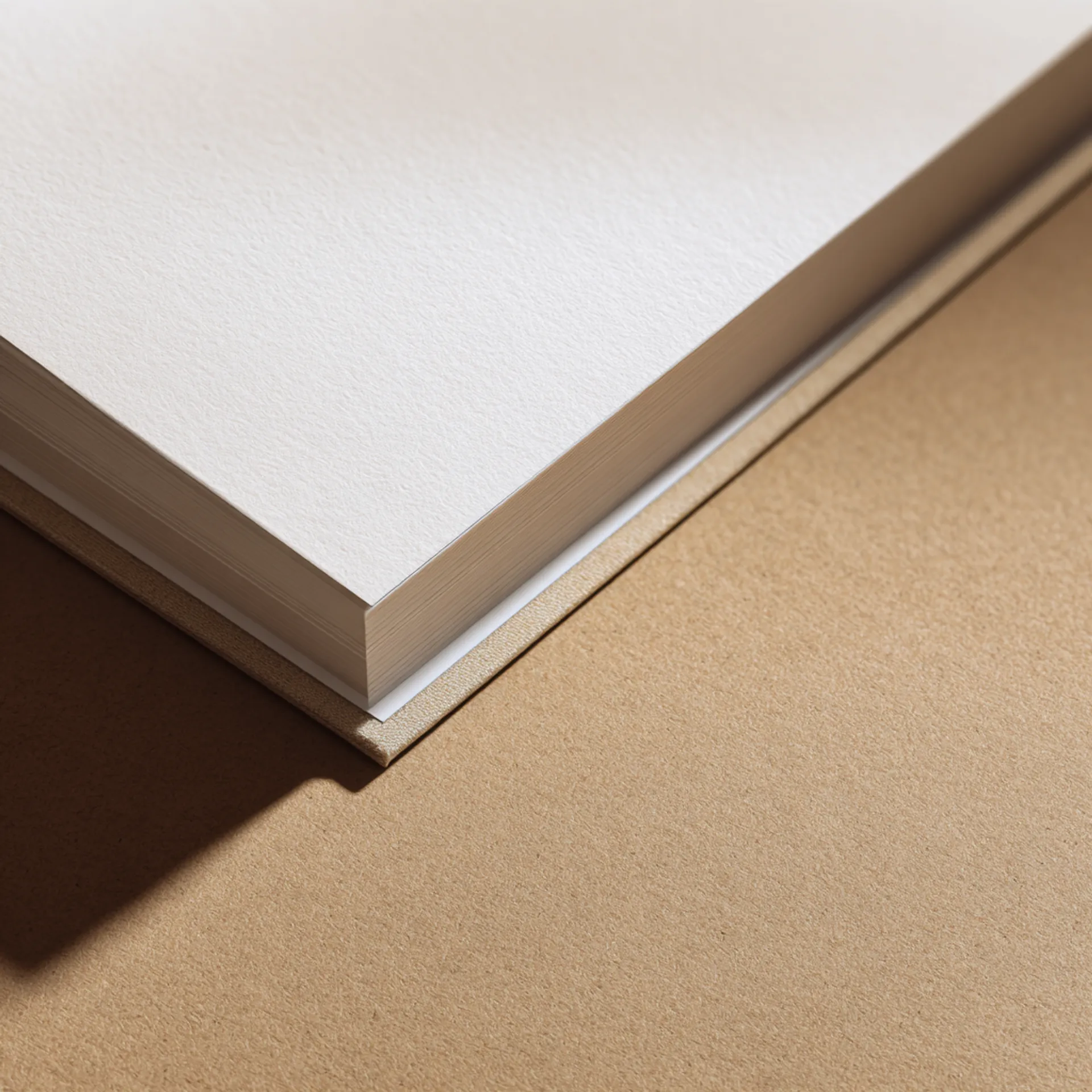
Paper selection. Graphic novel interiors require coated stock — paper with a clay coating that holds ink on the surface rather than absorbing it into the fiber. This produces sharper lines, more saturated colors, and better tonal range than uncoated paper. The standard weights are 80lb coated (the industry norm for trade paperbacks) and 100lb coated (for premium editions and deluxe hardcovers where heft matters). Below 80lb, the pages feel insubstantial and show-through becomes visible — the panels on the reverse side ghost through the page, which is distracting and unprofessional in a visual medium.
Finish matters. Coated stock comes in three finishes: gloss, matte, and silk (satin). Gloss produces the most saturated color and deepest blacks — it is the standard for manga and for graphic novels with dark, high-contrast art. Matte reduces glare and produces a softer reading experience — it is common in literary graphic novels and independent titles where the art has a wider tonal range and subtler palette. Silk splits the difference and is increasingly popular as a default. We stock all three in 80lb and 100lb weights.
Ink coverage and drying. A graphic novel page has dramatically higher ink coverage than a text page. A typical text page uses 5–8% ink coverage. A graphic novel page can hit 200–300% total ink coverage (all four CMYK channels combined) on panels with saturated darks, rich backgrounds, and heavy color. High ink coverage means more ink on the sheet, which means longer drying time, higher risk of set-off (wet ink transferring to the facing page during stacking), and more careful handling at the bindery. We manage this with appropriate drying intervals between printing and binding, and anti-set-off spray during the press run.
Linework Fidelity and Dot Gain
Sequential art is built on lines. Panel borders, character outlines, hatching, cross-hatching, speed lines, lettering — all of it depends on clean, consistent line reproduction. When lines thicken, bleed, or break up in print, the art looks wrong even if the reader cannot articulate why.
The primary threat to linework is dot gain — the physical spreading of ink when it contacts paper. Every printing process produces some dot gain. On coated stock, it is relatively controlled (12–18%). On uncoated stock, it is higher (18–25%). The result is that a 0.5pt line designed on screen prints as a visually thicker line on paper.
We compensate with a dot gain curve calibrated for the specific stock and press conditions of each graphic novel run. During prepress, we apply the curve to the artwork so that what prints matches the intended visual weight. On the first press sheets of every run, we verify linework against the original file — checking that fine lines hold weight, hairlines are not dropping out, and heavy blacks are not filling in fine detail.
For artists working digitally, we recommend designing at the line weights you want to see in print and not assuming screen accuracy. For artists working from scanned ink originals, we adjust during preflight — scanned linework often arrives with uneven density from the scanning process, and normalizing it before printing produces cleaner results.
Color Accuracy Across Panels, Pages, and Press Sheets
Color consistency in a graphic novel is more demanding than in almost any other print product. A character’s skin tone, costume color, and environment palette must match across every panel on every page — and across press sheets, which are printed at different times during the run. A slight shift in skin tone from page 12 to page 48 is invisible in a photography book but glaring in a graphic novel where the reader is tracking the same character across hundreds of panels.
We manage color consistency through press-side calibration. Before the full run begins, we print a set of verification sheets and measure color values with a spectrophotometer at multiple points across the sheet. We calibrate ink density and color balance to the target values, then verify periodically throughout the run. For critical projects — flagship titles, series where color must match previous volumes — we offer press checks where you approve color in real time during the print run.
The CMYK skin tone problem. Skin tones are the most difficult color to print consistently in CMYK because the human eye is extremely sensitive to shifts in flesh color. A 3–5% shift in magenta or yellow that would be invisible on a landscape background becomes immediately noticeable on a face. If your graphic novel features characters with a range of skin tones, we pay particular attention to skin tone consistency during calibration. Provide reference swatches or Pantone callouts for key character skin tones if color accuracy is critical.
Binding for Flat-Opening Spreads
Two-page spreads are a fundamental storytelling device in graphic novels. A panoramic landscape, a dramatic reveal, a battle scene — these compositions are designed to be read as single images. If the binding does not open flat enough, the center of the spread disappears into the gutter and the composition breaks.
Saddle stitch (single issues). Saddle-stitched comics open completely flat — the stapled spine allows the pages to lie flat or fold back entirely. This is why single issues have no gutter loss problem. It is also why the format is limited to low page counts (typically 24–48 pages).
PUR perfect binding (trade paperbacks). PUR adhesive is more flexible than standard EVA and allows the book to open wider. Gutter loss on a PUR-bound trade paperback is approximately 0.25–0.375 inches per side (0.5–0.75 inches total across the spread). This is the standard binding for graphic novel trade paperbacks. For spread-heavy titles, design with a minimum 0.375-inch clear zone on each side of the gutter center.
Smyth-sewn case binding (hardcovers). The best binding for flat opening. Smyth sewing stitches the signatures together with thread, allowing the spine to flex and the pages to open nearly flat. Gutter loss is approximately 0.125–0.25 inches per side. For deluxe hardcovers with important spread compositions, Smyth sewing is the correct binding method. We default to it for all graphic novel hardcovers.
Lay-flat binding. For graphic novels where spreads are the primary storytelling format — art books, oversized editions, visual spectacles — lay-flat binding opens completely flat with zero gutter loss. The text block is printed on single sheets (not folded signatures), and each sheet is attached to a flexible spine with adhesive strips. Lay-flat is more expensive than standard binding because every page is a separate sheet, but for spread-intensive projects, it eliminates the design compromise of gutter margins entirely.
Format Range: Floppies to Omnibus
Graphic novel printing spans a wider range of formats than any other genre, and each format has different production requirements:
Single issues (floppies). 24–48 pages, saddle-stitched, full color on 80lb coated stock. Cover on heavier stock (80–100lb coated) or card stock. Standard trim is 6.625 × 10.25 inches (comic book standard) or custom trim for indie formats. The production consideration is registration — on a saddle-stitched book with full-bleed pages, the inner pages creep outward slightly during folding, which means the bleed margin effectively narrows on inner pages. We compensate by applying a creep adjustment during prepress.
Trade paperbacks. 100–300 pages, PUR perfect bound, full color on 80lb coated stock. Cover on 12pt C1S with lamination. Standard trim is 6.625 × 10.25 inches or 6 × 9 inches (the bookstore-friendly format). This is the highest-volume graphic novel format.
Hardcover collected editions. 200–400 pages, Smyth-sewn case bound, full color on 80lb or 100lb coated stock. Optional dust jacket, foil stamping, and printed endsheets. Standard trim matches the trade paperback or is slightly larger (7 × 10.5 inches) for a premium feel.
Oversized deluxe / omnibus. 300–600+ pages, Smyth-sewn case bound, full color on 100lb coated stock. Oversized trim (8.5 × 11 inches or larger) to showcase the art at a scale closer to the original artwork. These are heavy, expensive books with high per-unit costs — they serve the collector market and are typically produced in runs of 100–500.
Typical Specs for Graphic Novels and Comics
Single Issue (Saddle-Stitched)
| Spec | Recommended | Notes |
|---|---|---|
| Trim size | 6.625 × 10.25 in (comic standard) | Custom trims available for indie formats |
| Binding | Saddle stitch (2 staples) | Page count limited to approximately 48 pages (12 sheets); heavier stocks reduce the practical maximum |
| Interior paper | 80lb gloss or matte coated | 70lb is acceptable for cost-sensitive runs but may show through on high-coverage pages |
| Cover stock | 80lb or 100lb coated, or card stock | Heavier than interior stock for durability and shelf presence |
| Interior color | Full CMYK throughout | Every page is a color page |
| Bleed | 0.125” on all sides | Full-bleed is standard in comics; no panel should stop at the trim edge without bleed |
Trade Paperback (Perfect Bound)
| Spec | Recommended | Notes |
|---|---|---|
| Trim size | 6.625 × 10.25 in or 6 × 9 in | 6.625 × 10.25 for direct-market continuity; 6 × 9 for bookstore shelving compatibility |
| Binding | Perfect bound (PUR adhesive) | PUR required for flat-opening performance on coated stock |
| Interior paper | 80lb matte or silk coated | Gloss for high-saturation art; matte or silk for literary/indie titles and extended reading |
| Cover stock | 12pt C1S with matte or gloss lamination | 14pt for thicker collected editions (250+ pages) for added rigidity |
| Spine text | Title, volume number, creator name | Minimum spine width for readable text is approximately 0.25 inches (roughly 80+ pages on 80lb coated) |
| Interior color | Full CMYK throughout | |
| Gutter margin | 0.375” minimum clear zone per side on spreads | 0.5” recommended for critical spread compositions |
Deluxe Hardcover
| Spec | Recommended | Notes |
|---|---|---|
| Trim size | 7 × 10.5 in or 8.5 × 11 in | Oversized for art showcase; match trade trim if this is the only hardcover format |
| Binding | Smyth-sewn case bound | Non-negotiable for graphic novel hardcovers; must open flat for spreads |
| Interior paper | 100lb matte or silk coated | Heavier stock signals premium and reduces show-through on high-coverage pages |
| Case cover | Printed wrap or cloth with foil stamping | Foil on title, creator name, and decorative elements |
| Dust jacket | Matte or soft-touch lamination with optional Spot UV | Spot UV on the title or a key visual element for tactile interest |
| Endsheets | Printed (character art, cover gallery, process sketches) | 80lb+ stock for hinge durability |
| Extras | Ribbon marker, head/tail bands | Standard for deluxe editions in this market |
Common Mistakes We See
- Interior printed on uncoated stock. Uncoated paper absorbs ink, which softens lines, mutes colors, and produces muddy darks. If the graphic novel was drawn and colored for coated stock (which nearly all are), printing on uncoated produces a dramatically different result than intended. Uncoated is a deliberate aesthetic choice for a very small number of indie titles — it should not be a cost-saving default.
- Line art submitted at 300 DPI instead of 1200 DPI. 300 DPI is correct for photographic images and painted artwork. Inked linework — panel borders, character outlines, hatching — needs 1200 DPI to reproduce without visible jagging. If your files are a mixture of painted color and inked lines (common in modern graphic novels), the composite file should be at least 600 DPI, with pure linework layers at 1200 DPI.
- Spread artwork designed without gutter allowance. Critical visual information (faces, text, key action) placed in the center of a two-page spread will be partially hidden by the binding. Design all spreads with a clear zone at the gutter — the width depends on the binding method (see Binding section above).
- Cover file designed at the wrong trim size. Graphic novels use non-standard trims compared to text-based books. A cover template built for a 6 × 9 text novel does not fit a 6.625 × 10.25 comic. Download the correct template for your format before designing the cover.
- Saddle-stitched single issues without creep adjustment. In a saddle-stitched book, inner pages shift outward slightly when the signatures are nested and folded. On a 48-page comic with full-bleed art, the innermost pages can shift enough that the bleed is trimmed unevenly. We apply creep adjustment during prepress, but the original files should be designed with 0.125” bleed on all sides to give us room to compensate.
- Ink coverage exceeding 300% total without adjustment. Total ink coverage (C+M+Y+K) above 300% on coated stock can cause drying problems, set-off, and blocking (pages sticking together). Rich black panels should be built at 60C/40M/40Y/100K (200% total) rather than 100C/100M/100Y/100K (400%). We check total ink coverage during preflight and flag any areas above 300%.
- RGB color mode in print files. Graphic novels created digitally are almost always built in RGB for screen display. The files must be converted to CMYK for print. This conversion shifts colors — particularly saturated blues, violets, and bright greens, which fall outside the CMYK gamut. Convert to CMYK before submitting files and adjust any shifted colors manually. If you submit RGB files, we will convert them, but the color shift may not match your expectations.
Preflight Checklist
Before submitting files for a graphic novel or comic:
- All files are CMYK color mode — not RGB
- Resolution is 600 DPI minimum for composite color+line artwork; 1200 DPI for pure line art pages
- Interior PDF is single-page (not reader spreads), pages in sequential order
- Cover PDF includes 0.125” bleed on all sides and spine width matches our template
- All interior pages include 0.125” bleed on all sides (full-bleed is the standard for sequential art)
- Two-page spreads designed with a gutter clear zone (minimum width depends on binding method)
- Total ink coverage does not exceed 300% anywhere in the file; rich blacks built at 60/40/40/100
- Fonts embedded (all lettering, title pages, credits — including fonts in placed images)
- For saddle-stitched single issues: page count is a multiple of 4
- For perfect-bound trades: page count is final — changes require a spine recalculation and new cover template
- Cover file uses the correct trim size template for the format (comic trim, not book trim)
- Proof review at 100% zoom to verify linework fidelity, especially on fine hatching and thin panel borders
- ISBN barcode on back cover for retail distribution; UPC barcode for direct-market single issues
How a Graphic Novel Project Moves Through Production
1. File Intake and Spec Confirmation
You submit interior and cover PDFs through our upload portal. We confirm trim size, paper stock and finish (gloss, matte, or silk), binding method, and format. For series titles (ongoing single issues or multi-volume trade paperbacks), we pull your stored specs from previous orders and confirm the new installment matches.
Genre-specific checkpoint: We verify color mode (CMYK), total ink coverage on the highest-coverage pages, linework resolution, and bleed on every page. For trade paperbacks with important spreads, we map the spread positions and verify gutter clearance. For saddle-stitched single issues, we calculate creep and apply the adjustment before proofing.
2. Preflight and Color Proofing
Preflight for graphic novels is more intensive than for text-based books. We check every page for resolution, color mode, ink coverage, and bleed — not just spot checks. Linework is evaluated for dot gain impact, and we apply the dot gain compensation curve for your specific stock.
You receive a digital proof for approval. For color-critical projects, we strongly recommend a physical press proof (adds 3–5 business days). Graphic novel artwork is created and evaluated on RGB screens, and the CMYK conversion produces a narrower gamut on paper. Saturated blues, violets, and bright greens shift the most. A physical proof on your actual stock reveals these shifts in a way that a screen proof cannot.
Genre-specific risks: Dot gain thickening fine linework. Color shift from RGB-to-CMYK conversion. Total ink coverage causing set-off on high-saturation pages. Gutter loss on spreads.
3. Printing and Drying
Graphic novel pages have the highest ink coverage of any book format. We print on sheet-fed offset presses for runs above 500 and digital presses for shorter runs, with drying intervals calibrated for the ink load and stock. High-coverage pages (dark backgrounds, saturated full-bleed panels) require longer drying intervals to prevent set-off and blocking.
Genre-specific risk: Set-off — wet ink from one page transferring to the facing page during stacking. On a graphic novel with 250%+ total ink coverage across multiple pages, set-off risk is significant. We use anti-set-off spray during the press run and allow adequate drying time before the sheets enter the bindery.
4. Binding and Finishing
Saddle-stitched single issues are folded, collated, stitched, and three-knife trimmed. Turnaround is typically 7–10 business days from proof approval.
Perfect-bound trade paperbacks are scored, collated, PUR-bound, and three-knife trimmed. Covers are laminated before binding. Turnaround is typically 10–14 business days.
Smyth-sewn hardcovers are sewn, cased in with endsheets, and pressed. Dust jackets printed and applied separately. Foil and Spot UV applied before casing. Turnaround is typically 15–20 business days.
Genre-specific risk: Coated pages sticking together (blocking) if drying was insufficient. We inspect every run for blocking before binding, and any sheets that show adhesion are re-dried or rejected.
5. Packaging and Fulfillment
Single issues are packed flat in rigid mailers or boxes — not rolled. Trade paperbacks and hardcovers are shrink-wrapped and boxed. Deluxe hardcovers with dust jackets and foil are individually sleeved.
We ship to your address, your distributor, or multiple locations. For comic convention sales (NYCC, SDCC, ECCC, HeroesCon, SPX, local cons), we can pack in event-ready quantities.
Genre-specific consideration: Graphic novel creators frequently sell at conventions and through direct online stores in addition to (or instead of) traditional retail. If you are splitting your run between convention inventory and distributor stock, tell us at order time and we will pack accordingly.
Design and File Preparation
Color Management for Sequential Art
Color management is the single highest-impact technical step in graphic novel file preparation. Most sequential art is created, colored, and reviewed in RGB on calibrated (or uncalibrated) monitors. The CMYK gamut on paper is narrower than RGB on screen, and the shift is most visible in the colors that sequential art relies on most heavily.
What shifts in CMYK. Saturated blues (superhero costumes, night skies, energy effects), bright violets and magentas (magic effects, alien environments), and vivid greens (forests, alien landscapes, creature designs) all fall partially or entirely outside the CMYK gamut. These colors desaturate and shift during conversion. A bright electric blue on screen becomes a duller, slightly purple blue in CMYK print.
The fix. Convert to CMYK before submitting files, not after. Review every page in CMYK mode and adjust any colors that have shifted unacceptably. Pay particular attention to recurring colors (character costumes, environmental palettes) because inconsistency in a repeating color across pages is more noticeable than an overall shift.
Rich black. Black panels, shadows, and dark backgrounds should be built as rich black (60C/40M/40Y/100K), not flat black (0/0/0/100K). Flat black prints as a dark gray on coated stock — thin, washed out, and lacking depth. Rich black produces the dense, saturated black that graphic novel art requires. Total ink coverage on rich black is 200%, well within the 300% maximum.
Lettering and Text
Lettering is the most under-considered production variable in graphic novel printing. Dialogue balloons, captions, sound effects, and title text must be sharp, legible, and consistent across every page.
- Resolution. Lettering must be vector or placed at 1200 DPI minimum. Rasterized text at 300 DPI is visibly soft in print — the edges of letterforms blur, which makes dialogue balloons look unprofessional. If your lettering is done in a separate application (Illustrator, a dedicated lettering tool), export at the highest resolution available.
- Font embedding. All fonts must be embedded in the PDF. Missing fonts are silently substituted during RIP, producing wrong letterforms — and because lettering is on every page, a font substitution affects the entire book.
- Balloon placement. Speech balloons that overlap panel borders or extend into the bleed area can be clipped during trimming. Keep all balloons and text within the safe area (0.25” from trim edge minimum).
File Structure
We accept interior files as single-page PDFs (not reader spreads). Pages should be in sequential order, starting with page 1 (the first interior page after the cover). For saddle-stitched single issues, we handle the imposition — submit pages in reading order, not printer-spread order. Cover files are separate PDFs built to our template, which includes the spine width, bleed, and barcode placement zone.
If you are working with your own designer or handling files independently, we provide cover templates for every format (single issue, trade, hardcover) with accurate spine widths. Full specs are in the file preparation guide.
Spec Downloads and Tools
We provide production tools designed for graphic novel and comic printing workflows:
- Cover template generator — Enter your format (single issue, trade paperback, or hardcover), page count, and paper stock, and get a cover template with exact spine width, bleed marks, and safe area guides. Comic trim and book trim templates available. PDF and Adobe Illustrator formats.
- Spine width calculator — Spine width for graphic novels differs from text-based books because coated stock has a different caliper than uncoated. Our calculator uses the correct caliper for your chosen stock.
- Dot gain compensation guide — Reference for adjusting linework weight and color saturation to account for dot gain on coated stock. Includes recommended line weight minimums for 80lb gloss, 80lb matte, and 100lb stocks.
- Rich black and total ink coverage reference — CMYK build values for rich black, recommended maximum ink coverage, and instructions for checking total ink coverage in your files.
- Two-page spread gutter guide — Visual reference showing the gutter clear zone for each binding method (saddle stitch, PUR perfect, Smyth sewn, lay-flat), with overlay templates you can place on your spread artwork to verify clearance.
- Paper sample kit — Request physical samples of our coated stocks in gloss, matte, and silk finishes at 80lb and 100lb weights. Print a test panel on each to see how your artwork reproduces.
These tools are available in our Resources section. Artists and designers who work with our templates and guides submit production-ready files at a significantly higher rate, which means fewer preflight cycles and faster turnaround.
Trust Signals
Production volume: Origin Books prints single-issue comics, trade paperbacks, collected editions, and deluxe hardcovers for indie creators, small publishers, webcomic artists moving to print, and Kickstarter campaigns. We produce every graphic novel format — from 24-page saddle-stitched floppies to 500-page omnibus hardcovers.
Color calibration: Full-color graphic novel interiors are calibrated per-job, not run on default press settings. We measure and adjust ink density, dot gain, and color balance at the start of every graphic novel run, with periodic verification throughout. For critical projects, we offer in-person or remote press checks.
Bindery capability: PUR perfect binding, Smyth-sewn case binding, saddle stitching, foil stamping, 3D Spot UV, and lay-flat binding are performed in-house. Graphic novels require tighter binding tolerances than text-based books because coated stock is smoother and more prone to page pull-out if adhesive application is not calibrated for the stock. We manage this in our own bindery, not subcontracted.
Finishing equipment: Kluge foil stamping press with digital registration, UV coating line, three-knife trimmer with digital measurement, and saddle-stitch line with creep compensation. The same bindery equipment used for high-end trade publishing.
Convention logistics: We have shipped graphic novels to NYCC, SDCC, ECCC, HeroesCon, SPX, TCAF, and regional comic conventions. We understand event-driven timelines and pack in convention-ready quantities.
For the full selection of paper options, binding methods, and finishing techniques, see Paper and Materials and Binding Options.
Next Steps
Ready to print? Request a quote with your format (single issue, trade, or hardcover), trim size, page count, paper stock preference, and quantity. If you are producing a variant cover run, note the number of variants and copies per variant.
Need templates? Download cover templates for your format — single-issue comic trim and book trim templates available, with accurate spine widths calculated from coated stock caliper.
Planning a Kickstarter or convention run? Talk to our production team before you set your timeline. Full-color graphic novels on coated stock require longer drying and binding windows than text books, and we can help you build a realistic production schedule.
Have production questions? Talk to our production team — not a sales team. You will speak with someone who understands coated stock behavior, dot gain, binding for flat-opening spreads, and the specific demands of sequential art printing.
Graphic Novel & Comic Printing — Production FAQ
Why do my fine lines look thicker in print than on screen?
Dot gain. When ink hits paper, it spreads slightly — on coated stock, typically 12–18% depending on the sheet and press conditions. A 0.5pt line on screen becomes a visually thicker line in print. On uncoated stock, dot gain is higher (18–25%), making the effect more pronounced. We compensate during prepress by adjusting the dot gain curve for your specific stock, and we run a press sheet verification at the start of every graphic novel run to confirm that linework is holding weight. If your artwork was created digitally and you have control over line weights, we recommend designing at the line weights you want in print — do not assume the screen version will match. If you are working from scanned ink originals, we adjust during preflight.
What is the difference between coated matte and coated gloss for graphic novel interiors?
Gloss coated stock produces higher color saturation, sharper contrast, and a slick, reflective surface. Colors look more vivid, blacks are deeper, and fine detail is crisper. The tradeoff is glare — under direct or overhead lighting, gloss pages reflect light and can be difficult to read. Matte coated stock reduces glare significantly, produces a softer, more natural reading experience, and is easier to handle (less slippery). Colors are slightly less saturated and blacks are slightly less dense than on gloss. For graphic novels with dark, atmospheric art, gloss tends to perform better because the deep blacks and saturated darks carry the visual tone. For graphic novels with a wider tonal range, detailed backgrounds, and extended reading sessions, matte is more comfortable. Silk (satin) coated stock splits the difference — moderate sheen, moderate saturation, minimal glare. We stock all three and can send samples.
Can you match the color of my previous print run from another printer?
Usually, yes. We need a physical copy from the original run plus the original print-ready PDF. We measure the existing book — paper stock, ink density, dot gain, and color values on a spectrophotometer — and calibrate our press settings to match. If the original printer used a proprietary stock that we do not carry, we identify the closest equivalent in our inventory and disclose the difference before you approve the proof. For critical color matching (flagship titles, series continuity), we recommend a physical press proof printed on your actual stock.
How do I prevent art from being lost in the gutter on two-page spreads?
You cannot eliminate gutter loss entirely in a bound book — the binding consumes physical space. But you can minimize it. In a PUR perfect-bound trade paperback, expect to lose 0.25–0.375 inches on each side of the gutter (0.5–0.75 inches total). In a Smyth-sewn hardcover, gutter loss is less because the binding opens flatter — roughly 0.125–0.25 inches per side. Design your spreads with a clear zone across the center: no critical artwork, text, or panel borders in the gutter area. Faces, speech balloons, and important visual information should be offset from the center by at least 0.375 inches on each side for perfect binding, or 0.25 inches for Smyth sewing. We verify gutter clearance on every spread during preflight and flag any critical content that will be compromised.
What is the minimum order for single-issue comics?
We can print as few as 25 copies of a saddle-stitched single issue. At that quantity, the printing is fully digital, which means no plate charges and the ability to print variant covers (different cover art on the same interior) without additional setup cost. The per-unit cost at 25 copies is higher than at 250, but the total investment is modest for a debut issue or a limited variant. Most indie comic creators start with 100–250 copies of a new issue and reorder as needed.
Why does my graphic novel feel flimsy compared to a bookstore trade paperback?
Two common causes: paper weight and cover stock. If the interior is printed on 60lb or 70lb stock instead of 80lb or 100lb, the pages feel thin and the book lacks heft. Graphic novel readers expect a substantial page feel because they associate the format with the trade paperbacks they buy at retail, which are almost universally printed on 80lb+ coated stock. Similarly, a 10pt cover on a graphic novel feels light. The standard is 12pt C1S with lamination (matte or gloss), and for thicker collected editions, 14pt provides additional rigidity and shelf presence.