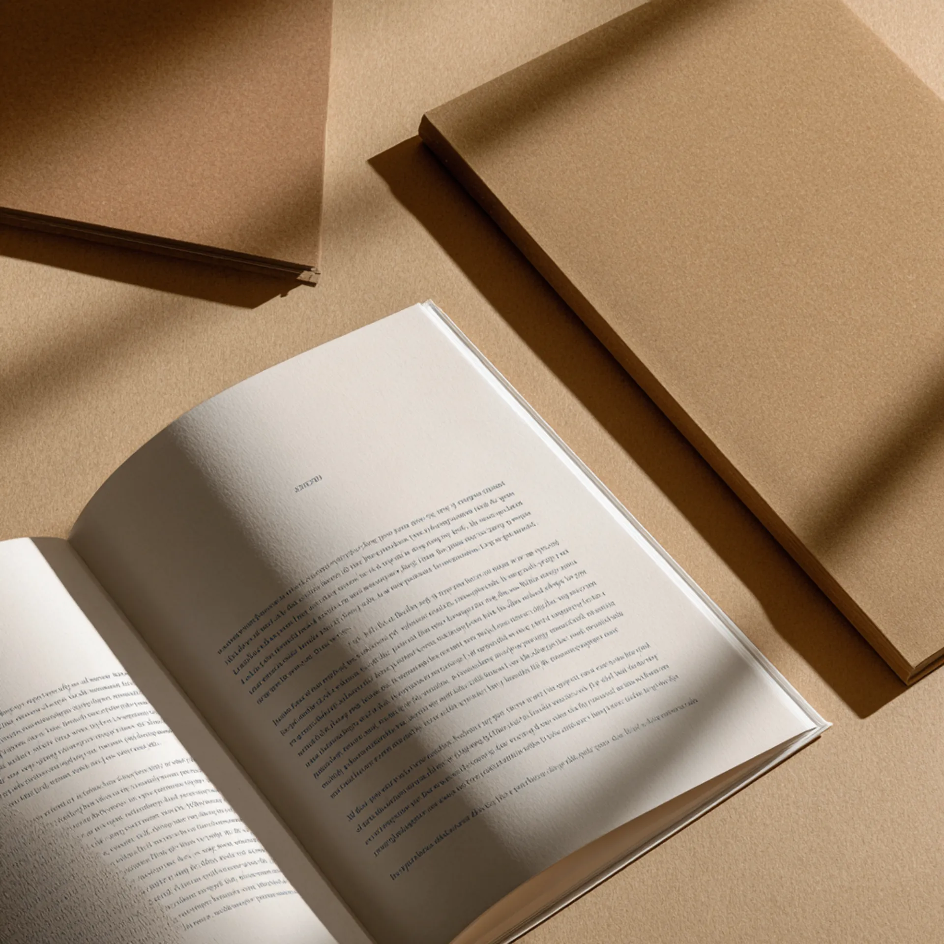
Journal & Notebook Printing
Lay-flat binding, bleed-through-resistant paper, and interior registration precise enough that a ruled line meets the spine without drifting — printed for the product category where the user handles every page.
Built for How Journals Are Actually Used
Paper Selected for Writing, Not Reading
Journal paper must resist ink bleed-through, handle fountain pens without feathering, and accept pencil without excessive smearing. We stock papers tested for writability — not just opacity and brightness.
Lay-Flat and Full-Open Binding
Smyth-sewn sections, Wire-O, spiral, and lay-flat adhesive binding — each engineered for a journal that stays open on a desk without being held, without the spine cracking, and without pages pulling loose after months of daily use.
Interior Pattern Registration
Ruled lines, dot grids, and graph grids must align precisely across every page and meet the spine margin consistently. Registration drift — where the grid shifts slightly between signatures — is visible to journal users and signals poor production quality.
Branded and Retail-Ready Finishing
Foil-stamped covers, debossed logos, belly bands, shrink wrap, and custom packaging for journals sold at retail, used as corporate gifts, or distributed at events.
Who This Page Is For
This page is for journal designers, stationery brands, planner creators, authors producing guided journals, corporate marketing teams ordering branded notebooks, event organizers, and retailers developing a private-label journal line — printing custom journals and notebooks in runs of 25 to 5,000 copies. Whether you are producing a ruled Moleskine-style notebook for retail, a guided gratitude journal to sell alongside a book, a branded hardcover journal for a corporate retreat, a dot grid bullet journal for the stationery market, or a dated planner with monthly, weekly, and daily layouts, the production guidance here applies.
Journal printing is not book printing. Books are read. Journals are used. A reader interacts with a book’s content — the paper is a carrier for text and images. A journal user interacts with the paper itself — writing on it, drawing on it, pressing into it with a pen tip. This means the production priorities are inverted. In book printing, the primary concern is how ink looks on the paper (readability, image reproduction, color accuracy). In journal printing, the primary concern is how the paper receives ink from the user’s pen (bleed-through resistance, feathering control, smoothness, tooth) and how the binding performs under daily use (flat opening, spine durability, page retention).
Most book printers offer journals as a side product, applying book printing defaults to a different product category. The result is journals with paper that bleeds through, binding that does not open flat, and ruled lines that drift at the spine. This page explains what actually changes in production when you print journals and notebooks, where the failures occur, and how to spec the product correctly.
What Changes in Production for Journals and Notebooks
Journal production inverts several assumptions from book printing. The paper is selected for writing performance, not print reproduction. The binding is selected for repeated daily opening, not single-reading durability. The interior pattern (ruled lines, dot grids, graph grids) demands registration precision that body text does not. And the product is often a retail or branded object, which means finishing and packaging matter more than they do for books.
Paper Selection for Writing Performance
In book printing, paper is evaluated on opacity (preventing show-through of printed text), brightness (contrast with ink), and surface smoothness (image reproduction quality). In journal printing, paper must also be evaluated on writability — a set of characteristics that book printing does not typically test for.
Bleed-through resistance. When a user writes on a journal page with a fountain pen, rollerball, or heavy gel pen, the ink must not soak through the sheet and appear on the reverse side. Bleed-through is controlled by fiber density (how tightly the paper fibers are packed), sizing (chemical treatment that controls ink absorption), and weight. A 70lb paper with tight sizing can outperform an 80lb paper with loose sizing. We stock journal-specific papers from mills that engineer for ink holdout, and we can provide samples for testing with your preferred writing instruments before committing to a stock.
Feathering. When ink spreads laterally along the paper fibers from the point of application, producing a fuzzy or ragged line instead of a clean one. Feathering is most visible with fountain pens and wet inks, and it is controlled by the same sizing treatment that controls bleed-through. Paper with good ink holdout generally resists feathering as well, but the two properties do not always correlate perfectly. We recommend testing with fountain pen ink if your target audience includes fountain pen users — the stationery market specifically values this characteristic.
Smoothness and tooth. Smooth paper allows pens to glide, which fountain pen and gel pen users prefer. Paper with more tooth (surface texture) grips pencil lead better, which pencil and colored pencil users prefer. The choice depends on the intended use: writing journals generally want smoother paper; sketching journals and art notebooks want more tooth. We stock both profiles.
Show-through. Distinct from bleed-through, show-through is when the printed content on the reverse side of the page is visible through the sheet under normal lighting — not because ink soaked through, but because the paper is not opaque enough. In journals, show-through means the ruled lines or dot grid on the reverse side ghosting through, which is distracting during writing. Higher-weight paper (70lb+) and higher-opacity stocks minimize show-through. For journals with dark or heavy interior patterns, we recommend 70lb minimum.
Color. White or cream. White is the standard for journals — it provides clean contrast for ink and a crisp look for ruled and dot grid patterns. Cream (natural) is warmer and easier on the eyes for extended writing sessions. Cream also signals “premium” in the stationery market — Moleskine-style journals use cream paper. The choice is aesthetic and market-driven.
Binding for Daily Flat-Opening Use
Journal binding serves a different function than book binding. A book needs to survive one or two readings. A journal needs to survive daily use for months or years — opened to the same page for hours, bent backward during one-handed writing, stuffed into bags, and flexed at the spine hundreds of times.
Smyth-sewn hardcover. The premium journal binding. Signatures are stitched with thread, producing a spine that is strong, flexible, and durable enough for years of daily use. A Smyth-sewn journal opens relatively flat — not completely flat, but flat enough for comfortable two-page writing. The gutter margin is accessible but some page curvature remains near the spine. This is the binding used by Moleskine, Leuchtturm, and other premium journal brands. It looks and feels like a book, which makes it appropriate for retail and gift markets.
Lay-flat adhesive binding. Individual sheets (not folded signatures) are bound with a flexible adhesive to a wrap-around cover. The result is a journal that opens completely flat — the spread lies flat on a desk without any page curvature. This is the optimal binding for writing comfort because the full writing surface is accessible on every page. The tradeoff is durability — lay-flat adhesive binding is not as strong as Smyth sewing under extreme use, and pages can pull loose if the journal is repeatedly bent backward. It is best for desk-based writing (planners, desk journals, meeting notebooks) rather than carry-everywhere pocket journals.
Wire-O binding. The most functional binding for lay-flat use. Pages open completely flat, fold back 360 degrees, and can be folded to a single page for compact use. Wire-O is ideal for lab notebooks, workshop manuals, recipe journals, and any application where the user needs one page open and accessible while working with both hands. The tradeoff is aesthetics — Wire-O journals do not look like books, they do not stack neatly on bookstore shelves, and they do not have a printable spine. For retail journals, Wire-O is a niche choice. For functional notebooks, it is often the best one.
Spiral binding. Similar functionality to Wire-O (flat opening, 360-degree fold-back) with a plastic coil instead of metal wire. Less rigid than Wire-O, cheaper per unit, and available in a wider range of colors. The coil is visually less premium than metal wire. Spiral is common for planners, school notebooks, and functional journals where cost matters more than luxury feel.
Perfect binding (PUR). The standard book binding method. PUR-bound journals do not open flat — they resist opening and tend to close themselves if not held. For this reason, PUR perfect binding is generally not recommended for journals unless the product is a guided journal meant to be read more than written in (a prompted journal where the user writes one line per day, for example). If you must use perfect binding for cost reasons, PUR is mandatory — EVA hot-melt adhesive is too brittle for the repeated daily opening that journals require.
Interior Pattern Registration
Journal interiors are more production-sensitive than book interiors because the user sees the pattern on every page — not just reads text, but evaluates the geometry of ruled lines, dot spacing, and grid alignment. A book reader does not notice if a text line shifts 0.5mm between signatures. A journal user notices if a ruled line shifts 0.5mm at the spine, because they are writing along that line and the misalignment disrupts the writing surface.
Cross-gutter alignment. On a ruled journal, lines should appear to continue from the left page across the spine to the right page when the journal is open flat. In practice, perfect cross-gutter alignment is extremely difficult to achieve in bound books because the two pages are on different sheets (or different parts of the same sheet), and folding introduces tolerance. We design interior patterns with a gutter margin — a clear zone where no lines, dots, or grid marks appear within 0.25–0.375 inches of the spine edge. This prevents the visual distraction of misaligned patterns at the gutter while maintaining a clean, intentional appearance.
Signature-to-signature consistency. Each signature (typically 16 pages) is printed on a single press sheet and folded. The pattern registration within a signature is tight — the press holds position across the sheet. Between signatures, there can be slight variation as each sheet is positioned independently on the press. For journals with visible geometric patterns (dot grid, graph grid), this inter-signature drift must be minimized. We hold tighter sheet registration tolerances on journal production than on standard book production.
Pattern-to-trim alignment. The ruled or grid pattern must be centered on the trimmed page, with equal margins on all sides. If the pattern drifts relative to the trim (the grid is 2mm closer to the right edge than the left, for example), the pages look off-center. We verify pattern-to-trim alignment on the first printed sheets and adjust before the full run proceeds.
Retail Finishing and Packaging
Journals sold at retail or used as branded gifts are consumer products, not just printed goods. The finishing and packaging create the tactile and visual first impression that drives purchase decisions and perceived value.
Cover materials. Hardcover journals use case-wrapped covers in a range of materials: coated paper wrap (printed with full-color artwork), cloth (linen, canvas, or buckram in solid colors), faux leather (PU or bonded leather), or kraft paper. Each material communicates a different market position — coated paper wrap for graphic/illustrated journals, cloth for literary and premium brands, faux leather for executive and corporate products, kraft for indie and eco-conscious brands.
Foil stamping. Metallic foil pressed into the cover material — a logo, title, or decorative element. Foil on a cloth or faux leather cover produces a classic, high-end look. Foil on a coated paper cover adds a premium accent to an illustrated design. Registration must be tight — foil on a logo needs to align precisely with the cover art or the deboss impression.
Debossing. A pressed impression of a design into the cover material without foil. Debossing creates a textured, tactile logo or pattern that the user can feel. It works particularly well on cloth and faux leather covers, where the impression is visible through the texture of the material. Debossing is subtler than foil — it signals quality without calling attention to itself.
Elastic closure. A fabric-covered elastic band that wraps around the journal to hold it closed. Standard on premium journals (Moleskine, Leuchtturm). The elastic is attached to the back cover during binding and wraps around to the front. Color can be matched to the brand palette.
Ribbon marker. A fabric ribbon attached to the headband, long enough to extend below the text block. Standard on premium journals. Color matched to the cover or brand.
Belly bands and packaging. For retail and gift journals, a belly band (a printed paper strip wrapped around the journal) communicates the brand, features, and pricing without requiring a full box. For premium gifts, a rigid box or a slipcase elevates the unboxing experience. We produce belly bands, rigid boxes, and slipcases in-house.
Rounded corners. The journal corners are die-cut to a radius instead of a sharp right angle. Rounded corners resist dog-earing and give the journal a softer, more finished feel. Common on pocket journals and premium notebooks.
Typical Specs for Journals and Notebooks
Premium Hardcover Journal (Retail / Gift)
| Spec | Recommended | Notes |
|---|---|---|
| Trim size | 5 × 8.25 in (A5-ish) or 3.5 × 5.5 in (pocket) | A5 is the dominant journal size at retail; pocket for carry-everywhere notebooks |
| Binding | Smyth-sewn hardcover | The premium journal standard; durable, opens relatively flat |
| Interior paper | 70lb–80lb white or cream uncoated | Selected for writing performance: bleed-through resistance, feathering control, smoothness |
| Interior pattern | Ruled, dot grid, graph grid, blank, or custom | 0.25–0.375” gutter margin on patterns for clean spine appearance |
| Cover material | Cloth, faux leather, or coated paper wrap | Material drives market positioning |
| Page count | 160–240 pages (80–120 sheets) | Journal page counts are typically counted in sheets (leaves), not pages |
| Extras | Elastic closure, ribbon marker, rounded corners | Standard for the premium journal market |
| Finishing | Foil stamping or debossing on cover | Logo, title, or decorative element |
Guided / Prompted Journal (Retail / Author Product)
| Spec | Recommended | Notes |
|---|---|---|
| Trim size | 5.5 × 8.5 in or 6 × 9 in | Slightly larger for prompted journals with more printed content per page |
| Binding | Smyth-sewn hardcover or lay-flat adhesive | Lay-flat recommended if prompts and writing space share each spread |
| Interior paper | 70lb white uncoated | White for clean contrast with printed prompts and writing lines |
| Interior layout | Custom: prompts, writing lines, illustrations, quotes | Each page or spread has a unique layout; not a repeating pattern |
| Cover stock | Hardcover with coated paper wrap or softcover with matte lamination | Guided journals sold at retail benefit from illustrated covers that communicate the journal’s purpose |
| Page count | 100–200 pages | Guided journals are typically shorter than blank journals |
Branded Corporate Notebook
| Spec | Recommended | Notes |
|---|---|---|
| Trim size | 5 × 8.25 in (A5) or 5.5 × 8.5 in | A5 fits in laptop bags and is the corporate notebook standard |
| Binding | Smyth-sewn hardcover or Wire-O | Smyth-sewn for premium gifts; Wire-O for functional meeting notebooks |
| Interior paper | 70lb white or cream uncoated | Cream signals premium for gift notebooks |
| Interior pattern | Ruled or dot grid, with optional branded header or footer | Subtle branding on interior pages (a logo watermark, a branded page number style) adds a custom touch |
| Cover material | Faux leather or cloth with debossed or foil-stamped logo | Faux leather is the standard for corporate notebooks |
| Extras | Elastic closure, ribbon marker, branded endsheets | Branded endsheets (printed with the company mission, contact info, or a welcome message) elevate the product |
| Packaging | Belly band or rigid box | Box for executive gifts; belly band for conference giveaways |
Planner / Dated Journal
| Spec | Recommended | Notes |
|---|---|---|
| Trim size | 5.5 × 8.5 in, 6 × 9 in, or 8.5 × 11 in | Size depends on layout density: daily planners need more page space |
| Binding | Wire-O or lay-flat adhesive | Wire-O for planners that need to fold back to a single page; lay-flat for desk-based planners |
| Interior paper | 70lb white uncoated | Must support both writing and the printed layout (monthly/weekly grids, daily schedules) |
| Interior layout | Custom: monthly calendars, weekly spreads, daily pages, note sections | Complex mixed-layout interiors with section transitions |
| Cover stock | 12pt–14pt C1S with matte or soft-touch lamination | Soft-touch for a premium tactile feel |
| Page count | 150–300 pages | Dated planners with daily pages are the thickest journal format |
| Extras | Tab dividers (monthly), sticker sheets, pocket folder on inside back cover | Functional extras that planner users expect |
Common Mistakes We See
- Paper selected for printing, not writing. Standard book printing paper (60lb uncoated, optimized for ink absorption from a press) absorbs fountain pen and rollerball ink too aggressively, causing bleed-through and feathering. Journal paper must be selected specifically for writing performance. Request paper samples and test with the writing instruments your audience uses before committing.
- Perfect binding on a daily-use journal. PUR perfect binding does not open flat. The journal fights the user every time they try to write near the gutter. For any journal intended for daily writing, choose Smyth-sewn, Wire-O, spiral, or lay-flat adhesive binding.
- Ruled lines or dot grid extending to the spine edge. Patterns that run all the way to the gutter will show registration drift at the spine — lines that do not align between the left and right pages. Design all repeating patterns with a gutter margin (0.25–0.375” clear zone) to prevent this visible defect.
- Page count specified in pages instead of sheets. Journal conventions count sheets (leaves), not pages. A “192-page journal” has 96 sheets. Each sheet has two sides (pages). Confirm whether your page count means pages or sheets before production — confusing the two doubles or halves the final product.
- Interior pattern designed at screen resolution. Ruled lines, dot grids, and graph grids are fine geometric elements that need 600 DPI minimum for clean printing. A dot grid designed at 150 DPI prints with soft, slightly blurred dots that look fuzzy compared to a crisply printed competitor. Design patterns as vector art (Illustrator, InDesign) where possible; rasterize at 600 DPI minimum if vector is not an option.
- Elastic closure attached after binding. The elastic must be integrated during the binding process — attached to the back cover board before casing-in. Elastic glued on after binding is visible, weaker, and will detach with regular use.
- Foil art submitted as part of the CMYK cover file. Foil elements need to be on a separate layer or a separate file, not built into the CMYK artwork. Foil is a physical material applied by a die, not an ink layer printed by the press.
Preflight Checklist
Before submitting files for a journal or notebook:
- Interior pattern files are vector or 600 DPI minimum raster
- Interior pattern includes gutter margins (0.25–0.375” clear zone from spine edge)
- Interior pages are single-page PDFs in sequential order
- For mixed-layout journals (planners, guided journals): section transitions mapped to correct page positions
- Cover file includes 0.125” bleed on all sides; spine width matches our template for the page count and paper stock
- Foil stamping artwork on a separate layer or separate file from the CMYK cover art
- Deboss artwork provided as a vector file with clear indication of impression depth
- Paper stock confirmed after testing with target writing instruments (samples available on request)
- Page count confirmed in sheets (leaves), not pages — verify this matches your intent
- For Wire-O: page count within the practical range for the chosen wire diameter
- Elastic closure color and ribbon marker color specified
- For retail journals: belly band or packaging files submitted alongside the journal files
- For branded journals: logo file provided as vector (AI, EPS, or PDF) for foil die production
How a Journal Project Moves Through Production
1. File Intake and Spec Confirmation
You submit interior, cover, and finishing element files (foil art, deboss art, endsheet art) through our upload portal. We confirm trim size, paper stock, binding method, cover material, finishing options, and quantity.
Genre-specific checkpoint: We verify paper selection for writing performance — if you have not tested the stock, we recommend samples before confirming. We check interior pattern registration tolerances and verify that repeating patterns include gutter margins. For mixed-layout journals (planners, guided journals), we map section transitions to ensure correct page sequencing. For branded journals, we confirm foil die artwork and cover material compatibility.
2. Preflight and Proofing
Preflight checks pattern resolution, gutter margins, page sequencing, and cover bleed. For journals with geometric interior patterns, we verify registration on the first press sheet — confirming that ruled lines, dots, or grid marks are positioned consistently across all pages and that the pattern-to-trim alignment is centered.
You receive a digital proof for approval. For journals with foil or debossing, we recommend a physical proof (adds 3–5 business days) because foil registration on cover materials (especially cloth and faux leather) cannot be evaluated on screen.
Genre-specific risks: Interior pattern drift between signatures. Dot grid or ruled lines printing soft due to low resolution. Foil misregistration on debossed cover. Paper stock that bleeds through with the user’s writing instrument.
3. Printing and Binding
Smyth-sewn hardcovers: Signatures are printed, folded, collated, and sewn. Cover boards are cut, wrapped with cover material, and cased onto the sewn text block with endsheets. Elastic closure and ribbon marker are attached during casing-in. Turnaround is 15–20 business days from proof approval.
Wire-O and spiral: Pages are printed, collated, punched, and bound. Covers are printed and laminated before binding. Turnaround is 7–10 business days.
Lay-flat adhesive: Individual sheets are printed, trimmed, and bound with flexible adhesive to a wrap-around cover. Turnaround is 10–14 business days.
Foil and debossing are applied to the cover before casing-in (for hardcovers) or before binding (for softcovers). Foil adds 1–2 days. Debossing adds 1–2 days. Combined foil and deboss (foil pressed into a debossed impression) adds 2–3 days.
Genre-specific risks:
- Registration drift. Tighter folding tolerances on journal signatures add a small amount of time to the bindery process. We hold journal tolerances tighter than standard book tolerances.
- Foil adhesion on textured materials. Foil on cloth and faux leather requires higher press temperature and pressure than foil on coated paper. If the temperature is too low, the foil does not adhere. If too high, it can scorch the cover material. We run test impressions on the actual material before committing to the full run.
4. Packaging and Fulfillment
Retail journals are shrink-wrapped individually (to protect the cover finish and keep the elastic closure in place), then packed in cases. Belly bands are applied before shrink wrap. Rigid boxes are packed separately.
Branded/corporate journals are packed per the client specification — individually boxed for executive gifts, bulk-packed for conference distribution, or shipped in branded cartons for retail placement.
We ship to your address, your distributor, your fulfillment service, or directly to event venues. Split shipments (some to the office, some to a conference, some to a retail partner) are handled as a standard production step.
Design and File Preparation
Interior Pattern Design
Journal interiors fall into two categories: repeating patterns (ruled, dot grid, graph grid, blank) and custom layouts (planners, guided journals, prompted journals).
Repeating patterns. Design as a single master page in a vector application (Illustrator or InDesign). Define the line weight (0.25–0.5pt for ruled; 0.5–1mm dot diameter for dot grid), line or dot color (light gray is standard — 30–40% black — for minimal visual intrusion), spacing (standard ruled: 7–8mm; dot grid: 5mm; graph grid: 5mm), and gutter margin (0.25–0.375” clear zone from spine edge). The master page is replicated across the full page count.
Custom layouts. Each page or spread has a unique design. Build in InDesign as a multi-page document with each page laid out individually. Map section transitions (where monthly calendars become weekly spreads, where prompts become blank pages) to specific page positions and verify that transitions do not fall mid-spread.
Dot grid precision. Dot grid journals are popular in the bullet journal market, and the users are discerning. Dots must be perfectly circular (not ovals or pixels), evenly spaced in both directions, and consistently sized across all pages. Design dots as vector circles, not rasterized images. Export at 600 DPI minimum if rasterizing.
Cover Design for Journals
Journal covers serve dual duty — they are the brand identity and the physical interface the user touches every day. Cover material, finish, and design must align with the market position.
Retail journals. Illustrated covers (coated paper wrap) for graphic-driven brands. Solid cloth or faux leather with foil for premium/minimal brands. The cover is what sells the journal on a shelf — it must communicate the product category, the brand, and the quality level in a single visual impression.
Corporate journals. Clean, professional covers. Debossed or foil-stamped company logo on faux leather or cloth. Minimal design — the brand identity is the design.
Guided / author journals. Cover design that communicates the journal’s purpose (gratitude, productivity, creativity, wellness). Illustrated or typographic covers with the title, author name, and a visual that signals the journaling concept.
Spec Downloads and Tools
We provide production tools designed for journal and notebook production workflows:
- Cover template generator — Enter your page count, paper stock, and binding method, and get a cover template with exact spine width, bleed marks, and safe area guides. Templates for hardcover case wraps, softcover wraps, and Wire-O covers.
- Interior pattern templates — Downloadable master pages for ruled, dot grid, and graph grid patterns with correct line weights, spacing, gutter margins, and color values. Illustrator and InDesign formats.
- Paper writability sample kit — Request physical samples of our journal-grade papers in 60lb, 70lb, and 80lb weights, white and cream. Includes a blank test journal bound in each stock so you can test with your own pens.
- Foil and deboss artwork guide — File requirements for foil stamping and debossing, including vector format specifications, minimum detail size for clean impression, and guidance on foil color selection for different cover materials.
- Planner layout template — InDesign template with pre-built monthly calendar, weekly spread, and daily page grids for common planner formats. Customize with your own prompts, headers, and branding.
- Retail packaging spec sheet — Belly band dimensions, box specifications, and shrink-wrap options for retail-ready journal packaging.
These tools are available in our Resources section. Designers who use our interior pattern templates and writability samples submit production-ready files at a higher rate and avoid the most common journal-specific production issues.
Trust Signals
Production volume: Origin Books prints journals, notebooks, planners, and branded stationery for retail brands, stationery companies, authors, corporate marketing teams, and event organizers. Our journal production ranges from 50-unit corporate gift runs to 5,000-unit retail product launches.
Paper expertise for writing. We stock journal-specific papers tested for writability — bleed-through resistance, feathering control, and smoothness — not just the standard book printing stocks. We can provide physical samples for pen testing before production.
Registration precision. Journal interiors are held to tighter registration tolerances than standard book interiors. Ruled lines, dot grids, and graph grids are verified for cross-gutter alignment and pattern-to-trim centering on the first press sheets of every run.
Finishing capability. Foil stamping, debossing, combined foil-and-deboss, elastic closure attachment, ribbon markers, rounded corners, and custom packaging — all performed in-house. We control every finishing step, which is critical for journals where the finish is the product.
Retail packaging. Belly bands, rigid boxes, slipcases, and shrink-wrapping produced in-house for retail-ready journal products.
For the full selection of paper options, binding methods, and finishing techniques, see Paper and Materials and Binding Options.
Next Steps
Ready to print? Request a quote with your trim size, page count (in sheets), paper stock preference, binding method, cover material, and finishing options. If you are unsure about the paper, request a writability sample kit first.
Need templates? Download interior pattern templates and the planner layout template to prepare production-ready files.
Developing a retail journal line? Talk to our production team about material selection, finishing combinations, and per-unit cost optimization for your target retail price point.
Ordering branded corporate journals? Talk to our production team about custom finishing, minimum quantities, and reorder pricing for ongoing branded merchandise programs.
Have production questions? Talk to our production team — not a sales team. You will speak with someone who understands paper writability, binding for flat opening, registration precision, and the finishing details that separate a premium journal from a forgettable one.
Journal & Notebook Printing — Production FAQ
What paper weight prevents bleed-through from fountain pens?
Bleed-through resistance depends on paper weight, fiber density, and coating — not weight alone. A 70lb uncoated paper with tight fiber density can resist fountain pen bleed-through better than an 80lb paper with looser fibers. For fountain pen journals, we recommend 70lb–80lb uncoated paper from mills that engineer for writing performance rather than print performance — the key metric is ink holdout (how well the paper keeps ink on the surface rather than absorbing it through the sheet). We stock several options specifically for journal production and can send samples for testing with your preferred pen and ink combination. For ballpoint and gel pen journals, 60lb uncoated is adequate. For journals intended for markers, brush pens, or mixed media, 80lb–100lb is recommended.
What is the difference between Smyth-sewn, Wire-O, and lay-flat binding for journals?
Smyth-sewn binding stitches the signatures together with thread, then cases them into a hard or soft cover. It opens relatively flat (not completely flat) and is the most durable option — a Smyth-sewn journal can withstand years of daily use. It looks and feels like a premium book. Wire-O binding punches holes along the spine and threads a double-loop wire through them. It opens completely flat and folds back 360 degrees, making it ideal for journals used on small surfaces or held in one hand. The tradeoff is that Wire-O journals do not stack on a shelf like books — they are stationery products, not bookshelf products. Lay-flat adhesive binding uses a flexible adhesive on individual sheets (not folded signatures), allowing the book to open completely flat without wire. It offers the flat-opening benefit of Wire-O with the bookshelf appearance of perfect binding. It is more expensive than standard perfect binding but produces a superior writing experience.
Why do my ruled lines not align perfectly at the spine?
Registration drift. Interior pages in a bound journal are printed on large press sheets, then folded into signatures. Each fold introduces a small tolerance — typically ±0.5mm. Across 16 pages in a signature, these tolerances can compound, causing the ruled line pattern to shift slightly between one signature and the next. The result is a visible misalignment where lines from adjacent signatures do not meet at the gutter. We minimize this by holding tighter folding tolerances on journal production than on standard book production, and by designing the interior pattern with a gutter margin that accommodates the tolerance range. For dot grid and graph grid journals, we recommend a minimum 0.375-inch clear zone from the spine edge of the grid pattern to prevent visible drift at the gutter.
Can I print different interior layouts within the same journal?
Yes. Mixed-interior journals — for example, a planner with monthly calendar spreads, weekly planning pages, lined note pages, and dot grid pages all in the same book — are common. Each section prints from its own file or page range. The production consideration is section transitions: if a ruled section transitions to a dot grid section mid-signature, the pattern change falls on a specific page. We map the section transitions to ensure they fall where you intend and do not produce half-pages of one pattern and half-pages of another within a spread.
What finishing options work for branded corporate journals?
The most common corporate journal finishing options are: foil stamping on the cover (company logo, event name, or personalized text in gold, silver, or custom color foil), debossing (a pressed impression of the logo into the cover stock — no foil, just texture), custom endsheets (printed with the company brand, a motivational message, or event details), a ribbon marker in the brand color, and a belly band or custom box for gifting presentation. All of these can be applied at quantities as low as 50 units. For events, we can also produce different cover variants (different foil text for different departments, for example) within a single production order.
How do I price a custom journal for retail?
Retail journal pricing depends on the per-unit production cost, the retail markup, and the perceived value created by the materials and finishing. The production decisions that most affect perceived value (and therefore retail price) are: cover material and finishing (foil and debossing signal premium), paper quality (fountain-pen-friendly paper is a selling point for the stationery market), lay-flat binding (a meaningful functional upgrade over standard perfect binding), and packaging (a belly band or box elevates the unboxing experience). We can advise on which production upgrades deliver the most perceived value relative to production cost. Use the pricing calculator at /contact for exact per-unit cost at any spec and quantity.