Young Adult Book Printing
Matte softcovers, library-grade hardcovers, and collector editions with foil, stained edges, and printed endsheets — printed for the genre where physical presentation drives both institutional sales and reader loyalty.
Built for How YA Actually Sells
Library and School Hardcovers
Smyth-sewn case binding with reinforced hinges for high-circulation titles. YA hardcovers move through school and public library systems faster than almost any other genre — the binding has to survive it.
Spine-Matched Series Runs
We store trim, paper caliper, cover finish, and spine width data from every order so book five matches book one — even years apart, even at a different run size.
Collector Edition Finishing
Foil stamping, 3D Spot UV, printed endsheets, stained edges, ribbon markers, and custom case art for the special editions that YA readers collect, photograph, and display.
Subgenre-Accurate Covers
YA fantasy, contemporary, dystopian, thriller, and romance each have distinct visual codes. Our cover templates and design services are built around current category conventions — not generic "young adult" aesthetics.
Who This Page Is For
This page is for YA authors, indie publishers, and hybrid presses printing softcover novels, library-grade hardcovers, collector editions, or multi-volume series in runs of 25 to 5,000 copies. Whether you are producing a debut title, a five-book fantasy series, or a limited special edition for your existing readership, the production guidance here applies.
Young adult is one of the most physically active genres in publishing. YA readers buy physical books at higher rates than most adult fiction categories. They display them, photograph them, collect special editions, and line up series on shelves. At the same time, libraries and schools are the largest institutional buyers of YA hardcovers — and those books need to survive hundreds of checkouts.
This means YA printing serves two distinct markets with different production requirements: the collector and retail market (where aesthetics, finishing, and shelf presence matter) and the institutional market (where binding durability, reinforced construction, and standard trim sizes matter). Most printers treat YA as adult fiction with a different cover. It is not. The production decisions are different, and getting them wrong is visible to both readers and librarians.
What Changes in Production for Young Adult
YA printing shares a surface resemblance with adult fiction — black-and-white text on cream stock, matte softcovers, standard trims. But the genre’s production demands diverge in ways that affect paper choice, binding durability, cover finishing, and series management.
Cream Stock, Higher Page Counts, and Show-Through Risk
YA fiction — especially YA fantasy and dystopian — runs longer than most adult genre fiction. Page counts of 350–500 are common in the category. When you combine high page counts with cream uncoated stock, you have two competing pressures: readers want a book that feels substantial in hand, but heavier stock drives up spine width, weight, and unit cost.
The practical solution is calibrating paper weight to page count. For books under 350 pages, 60lb cream uncoated is the standard. For books over 400 pages, 50lb cream reduces bulk and weight without a noticeable quality drop — but it has lower opacity, which means ink show-through is a real risk.
We calibrate ink density at press setup for every YA run on 50lb stock: enough saturation for clean, high-contrast type, but not so much that text from the reverse side bleeds through the page. This calibration is checked on the first press sheets before the full run proceeds.
Library Hardcovers and Binding Durability
Libraries and schools are the single largest institutional market for YA hardcovers. A popular YA title in a school library may circulate 50–100 times before it is retired. A perfect-bound hardcover will not survive this. A case-bound hardcover with EVA adhesive may not either.
For library-destined YA hardcovers, we recommend Smyth-sewn case binding. Smyth sewing stitches signatures together with thread before casing in, which means the text block holds even if the adhesive degrades over time. The book also opens flatter, which matters for classroom and reading-group use.
We reinforce the hinge area (where the text block meets the case boards) because this is the first failure point in high-circulation hardcovers. The combination of Smyth sewing and reinforced hinges produces a book that meets the durability expectations of school and public library systems.
Matte Lamination and the Social Media Factor
Matte lamination is the default finish in YA publishing. It photographs without glare (critical for BookTok and Bookstagram), resists fingerprints at signing events, and signals “contemporary fiction” on a retail shelf.
Standard matte lamination shows fingerprints and scuff marks on dark covers — and YA covers frequently use deep, saturated color palettes (dark fantasy tones, moody blues, blacks). We use a soft-touch matte film that resists marking better than standard matte and adds a velvety hand feel that readers notice. For authors doing heavy event signing or convention sales, we can also apply a scuff-resistant overcoat.
Gloss lamination is occasionally used in YA — primarily for middle-grade crossover titles or graphic-novel-style covers where color vibrancy matters more than the matte texture. We will recommend the appropriate finish based on your cover art and target audience.
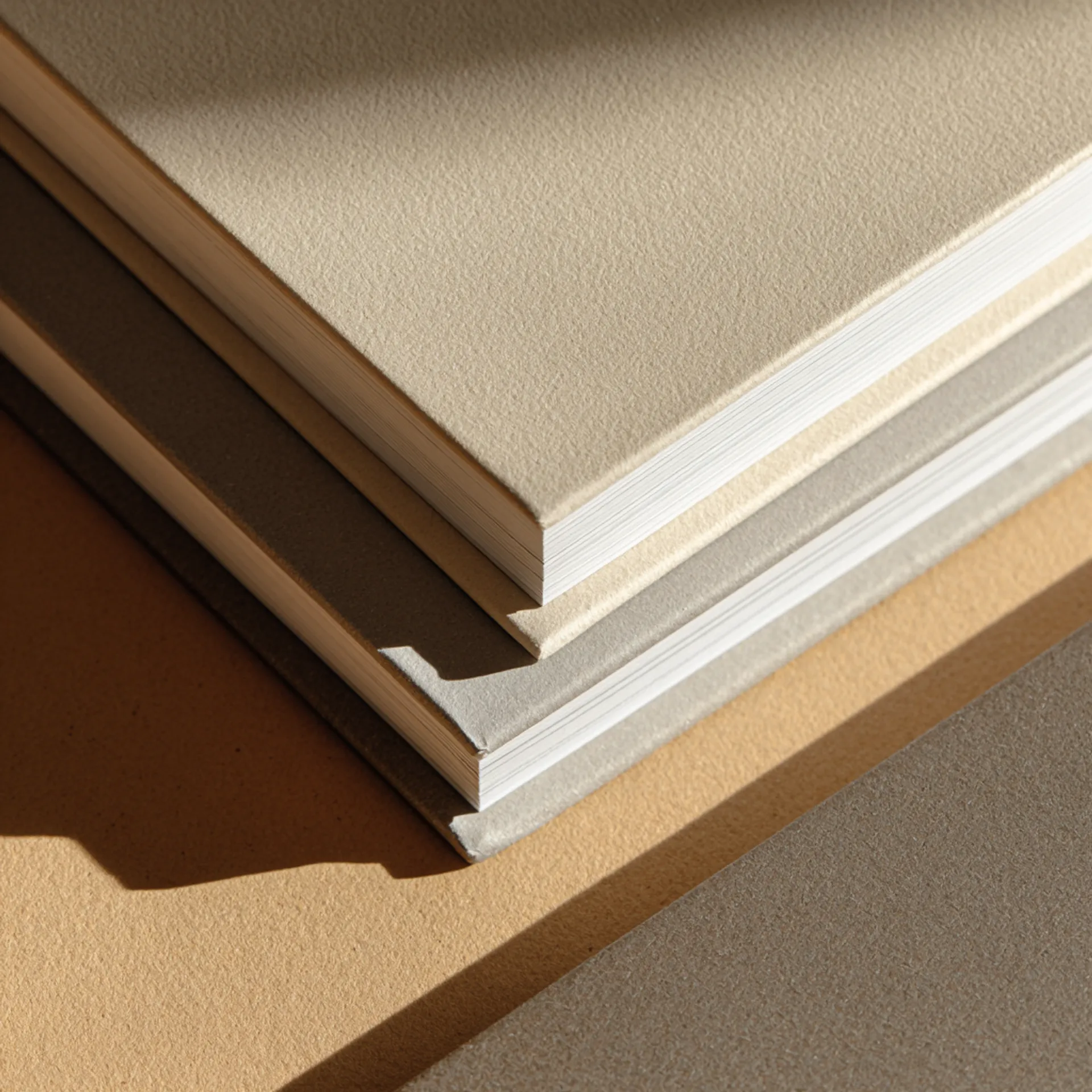
Series Spine Matching
YA is overwhelmingly a series-driven genre. Trilogies, quartets, and longer series dominate the category. Readers buy complete series and line them up — spine inconsistency (different widths, color drift between volumes, misaligned title text) is immediately visible and a common frustration.
Spine width is a function of three variables: page count, paper caliper, and binding adhesive thickness. Page count changes between volumes (book one is 280 pages, book three is 420). Paper caliper varies between mill lots. Adhesive application has a tolerance range.
We store the exact paper caliper, spine calculation, and cover template from every volume in your series. When a new volume enters production, we pull the stored data, measure the incoming paper lot, and adjust the spine template before generating the cover wrap. If the caliper has shifted enough to produce a visible width difference, we flag it and recommend a paper substitution from the same mill family.
For long-running series, this spec storage becomes increasingly valuable. By volume four or five, paper availability and mill lot variations accumulate — without stored data, spine drift is almost guaranteed.
Collector Edition Finishing
The YA collector edition market has expanded rapidly, driven by the same BookTok and reader-community dynamics as romance. YA readers — particularly in fantasy, romantasy, and dark academia subgenres — purchase special editions of titles they already own, specifically for the physical production quality.
YA collector editions typically involve some combination of:
- Foil stamping (metallic or pigment foil on the case cover and/or spine)
- 3D Spot UV (raised glossy texture on selected design elements — swords, crowns, magical elements)
- Printed endsheets (full-color character art, maps, or world-building illustrations)
- Stained or sprayed edges (colored page edges, increasingly expected in YA fantasy special editions)
- Ribbon markers (sewn-in fabric bookmarks, often in a color that matches the cover palette)
- Dust jackets with soft-touch lamination and a separate printed case beneath
- Reversible dust jackets (character art on the reverse side — a trend specific to YA)
Each finishing operation adds a production step with its own tolerance and failure mode. Foil registration must align to the cover art within 0.5mm. Spot UV must register to the foil layer beneath it. Edge staining must not bleed into the text block. These are bindery operations, not press operations, and they require equipment and experience that many digital-first book printers do not have in-house.
Origin Books runs all finishing in our own bindery. We do not subcontract foil, Spot UV, or edge work. This means we control registration, drying time, and quality inspection at every stage.
Typical Specs for Young Adult
Standard Softcover
| Spec | Recommended | Notes |
|---|---|---|
| Trim size | 5.5 × 8.5 in | The dominant YA trim. 5.25 × 8 is also used; 6 × 9 for literary crossover or high page counts |
| Binding | Perfect bound (PUR adhesive) | PUR is stronger than EVA and allows the book to open flatter |
| Interior paper | 60lb cream uncoated | 50lb cream for 400+ page titles to control bulk and weight |
| Cover stock | 12pt C1S with soft-touch matte lamination | 10pt is acceptable but more prone to curl |
| Spine text | Minimum 150 pages | Below 130 pages, spine text is not recommended |
| Interior color | Black-and-white | Grayscale spot illustrations or chapter header art at no additional cost |
Library Hardcover
| Spec | Recommended | Notes |
|---|---|---|
| Trim size | 5.5 × 8.5 in or 6 × 9 in | Match the softcover trim if both formats exist; 6 × 9 common for library editions |
| Binding | Smyth-sewn case bound | Thread-sewn for durability in high-circulation environments |
| Interior paper | 60lb cream uncoated | Match the softcover paper for consistency across formats |
| Case cover | Printed wrap with matte or gloss lamination | Full-color printed case; gloss is more durable for library use |
| Reinforcement | Reinforced hinges | Extends the life of the binding under heavy circulation |
| Dust jacket | Optional | Libraries often prefer printed cases without dust jackets (jackets get lost) |
Collector Special Edition
| Spec | Recommended | Notes |
|---|---|---|
| Trim size | 5.5 × 8.5 in or 6 × 9 in | Collector editions sometimes size up from the standard softcover |
| Binding | Smyth-sewn case bound | Stronger and opens flatter than perfect-bound hardcovers |
| Interior paper | 60lb cream uncoated | Match the standard edition paper |
| Case cover | Printed wrap with foil stamping | Full-color case + metallic foil on title, spine, or design elements |
| Endsheets | Full-color printed on 80lb uncoated | Character art, maps, world-building illustrations |
| Extras | Ribbon marker, stained edges, reversible dust jacket | Stained edges add 3–5 business days; reversible jackets require a separate print run of the jacket |
Common Mistakes We See
- Spine width calculated from page count alone. Spine width depends on paper caliper, not just page count. A 350-page book on 60lb cream is wider than a 350-page book on 50lb cream. Always calculate from actual caliper data — especially for series where consistency matters.
- Cover art designed at final trim with no bleed. Covers require 0.125” bleed on all sides. Missing bleed means white edges after trimming.
- Series covers designed without a variable spine template. If page count changes between volumes — and it almost always does in YA — the cover template must adjust. Design covers in a template that accepts variable spine width.
- Interior gutter margins too narrow for perfect binding. Perfect binding consumes 0.25–0.375” of the gutter margin. Interior text margins should be at least 0.75” on the gutter side, increased to 0.875” for books over 300 pages.
- RGB images in cover files. Cover files must be CMYK. RGB-to-CMYK conversion shifts colors, especially in the deep blues, purples, and teals that dominate YA fantasy covers.
- Map or illustration files at screen resolution. YA fantasy and dystopian novels frequently include interior maps. These must be at least 300 DPI at final print size. Maps designed for ebook at 150 DPI will print blurry.
- Endsheet art designed without accounting for the hinge. On hardcovers, the endsheet wraps over the hinge where the cover board meets the text block. Art that runs across this area will crack or distort. Design endsheets with a safe zone along the gutter fold.
Preflight Checklist
Before submitting files for a YA novel, verify:
- Interior PDF is single-page (not spreads), with pages in sequential order
- All fonts are embedded in both the interior and cover PDFs
- Cover PDF includes 0.125” bleed on all sides and matches the spine width from our template
- Interior gutter margin is at least 0.75” (0.875” recommended for 300+ page books)
- Page count is final — any changes after proof approval require a new cover template
- For series: confirm the trim size and paper stock match previous volumes
- Cover color mode is CMYK — check blues, purples, and dark tones especially
- Interior maps and illustrations are at least 300 DPI at print size
- Endsheet art (if applicable) includes a safe zone along the hinge
- ISBN barcode is placed on the back cover per retail requirements
- Content warnings page is included in front matter if applicable to your title
How a YA Project Moves Through Production
1. File Intake and Spec Confirmation
You submit interior and cover PDFs through our upload portal. For series titles, we pull your stored specs and confirm the new volume matches previous books in trim, paper, and cover finish. For new projects, we confirm trim size, paper stock, binding method, and any finishing options before preflight begins.
Genre-specific checkpoint: We verify cream vs. white stock selection, confirm spine width against actual paper caliper, and check that cover color values will reproduce accurately on your chosen lamination. For series, we compare the incoming volume’s page count against previous volumes and flag any spine width changes that require cover template adjustments.
2. Preflight and Proofing
Our preflight process checks resolution, bleed, margins, font embedding, and color mode. For YA covers, we pay particular attention to deep blues, purples, and teals in CMYK — these colors are among the most common in the genre (especially YA fantasy) and the most likely to shift between screen and print.
For interiors with maps or illustrations, we verify that all placed images meet the 300 DPI minimum at print size. Screen-resolution maps are the single most common preflight rejection in YA fantasy.
You receive a digital proof for approval. For collector editions or color-critical covers, we recommend a physical press proof (adds 3–5 business days). The press proof is printed on your actual cover stock with your actual lamination, so what you approve is what ships.
Genre-specific risk: Ink show-through on 50lb cream stock in high-page-count titles. We run a show-through check at press setup and adjust ink density before the full run proceeds.
3. Binding and Finishing
Softcovers go through PUR perfect binding, three-knife trimming, and lamination. Turnaround for softcover-only orders is typically 10–12 business days from proof approval.
Library hardcovers are Smyth-sewn, cased in with reinforced hinges, and wrapped with the printed cover. Dust jackets, if ordered, are printed and applied separately. Turnaround is 12–15 business days from proof approval.
Collector editions add finishing stages: foil stamping, Spot UV application, endsheet tipping, case making, edge staining, and ribbon insertion. Each step requires drying or curing time before the next operation. Collector editions typically require 15–22 business days from proof approval, depending on finishing complexity.
Genre-specific risks:
- Foil registration on fine detail. YA fantasy covers often feature intricate design elements — filigree, swords, crowns, constellation patterns. Fine lines and small elements are the hardest to foil cleanly. We recommend a minimum foil line width of 0.5mm and will flag any elements below that threshold during preflight.
- Edge stain bleed on high-page-count books. Books over 400 pages have a larger exposed edge surface area. We adjust the staining process for thicker text blocks to ensure even coverage without bleed into the interior pages.
4. Packaging and Fulfillment
Finished books are shrink-wrapped in packs of 5 or 10, then boxed. Collector editions are individually shrink-wrapped to protect finishing. We ship to your address, your distributor, or multiple locations.
Library and school orders: We can pack and ship directly to institutional addresses. If you are fulfilling library purchase orders, we can include packing slips with your publisher information.
Event and convention sales: YA authors frequently sell at book festivals, school visits, and fan conventions. If you need books by a specific event date, work backward from that date and add 5 business days of buffer. We offer rush production for an additional fee when schedules are tight. We can also pack in event-friendly quantities that reduce on-site handling.
Design and File Preparation
Cover Design by Subgenre
YA covers are genre-coded. Readers — and the algorithms that surface books online — identify subgenres visually before reading the title or blurb. A cover that signals the wrong subgenre will underperform regardless of the writing quality.
YA Fantasy / Romantasy: Illustrated character covers or symbolic design elements (weapons, crowns, magical flora). Rich color palettes — deep blues, purples, golds, blacks. Foil and Spot UV on collector editions. This is currently the highest-volume YA subgenre for physical sales and special editions.
YA Contemporary / Coming-of-Age: Illustrated or graphic-style covers with bold typography, bright or pastel palettes, and character art that conveys tone and setting. Similar to adult contemporary romance in visual style.
YA Dystopian / Sci-Fi: Symbolic or typographic covers. Stark, high-contrast design — often a single central image or symbol against a minimal background. Metallic foil on the title is common in this subgenre.
YA Thriller / Mystery: Dark, atmospheric covers with photographic or rendered imagery. Desaturated palettes. Sans-serif or distressed typography.
YA Horror / Dark Academia: Moody, texture-heavy covers. Botanical motifs, gothic elements, antique styling. Often the most finishing-intensive subgenre for collector editions — layered foil, embossing, and stained edges.
Interior Formatting
YA interiors follow a consistent standard with a few genre-specific considerations:
- Font: Serif typeface, 11–12pt, with comfortable leading. Garamond, Minion Pro, and Palatino are common. Some YA contemporary titles use sans-serif or mixed typography for a younger feel.
- Margins: 0.75–1” on all sides, with the gutter margin increased to 0.875–1” for books over 300 pages.
- Chapter openings: Decorative first lines, drop caps, or illustrated chapter headers. YA fantasy frequently uses ornamental dividers and stylized chapter numbering.
- Interior illustrations: Spot illustrations, chapter-header vignettes, and full-page maps are common in YA — especially fantasy. All illustrations must be 300 DPI minimum at print size, in grayscale for B&W interiors.
- Front matter: Title page, copyright page, dedication, map (if applicable), content warnings (increasingly standard in YA publishing).
- Back matter: Acknowledgments, about the author, also-by list, excerpt from the next book in the series, glossary or pronunciation guide (common in YA fantasy with invented languages or complex world-building).
The also-by list and next-book excerpt are high-value back matter for YA because series sell on backlist momentum. Design them to be prominent and scannable.
For authors preparing files independently, we provide templates and a spine width calculator. Full specs are in the file preparation guide.
Spec Downloads and Tools
We provide production tools designed for YA printing workflows:
- Cover template generator — Enter your page count and paper stock, get a cover template with exact spine width, bleed marks, and safe area guides. Available as PDF and Adobe Illustrator files.
- Spine width calculator — Calculate spine width from page count and paper caliper. Includes comparison mode for matching new volumes to existing series.
- YA preflight checklist — A downloadable checklist covering the file submission requirements specific to YA novels, library hardcovers, and collector editions.
- Endsheet and map template — Safe-zone guides for designing endsheet art and interior maps that account for the hinge fold and binding gutter.
- Paper sample kit — Request physical samples of our cream and white uncoated stocks in the weights used for fiction printing. See and feel the paper before committing to a stock.
These tools are available in our Resources section. Designers who work with our templates submit production-ready files at a higher rate, which means fewer preflight revisions and faster turnaround.
Trust Signals
Production volume: Origin Books prints YA titles for indie authors, hybrid presses, and small publishers across fantasy, contemporary, dystopian, thriller, and dark academia subgenres. We produce standard softcover runs, library-grade hardcovers, and limited collector editions.
Bindery capability: Foil stamping, 3D Spot UV, edge staining, ribbon marker insertion, and endsheet tipping are performed in-house — not subcontracted. This gives us direct control over registration, quality, and turnaround on the collector editions that YA readers expect.
Library-grade binding: Smyth-sewn case binding with reinforced hinges, built for the circulation demands of school and public library systems. We understand the institutional market because we print for it.
Series management: We maintain production records for multi-volume series, including paper caliper history, spine width data, and cover specifications. Authors printing book five get the same consistency as book one.
Finishing equipment: Kluge foil stamping press, UV coating line, and three-knife trimmer with digital measurement — the same bindery equipment used by trade publishers for special editions.
For the full selection of paper options, binding methods, and finishing techniques, see Paper and Materials and Binding Options.
Next Steps
Ready to print? Request a quote with your trim size, page count, quantity, and finishing preferences. If you are printing a series, include the volume number and we will pull your stored specs.
Need templates? Download cover templates, the spine calculator, and endsheet guides to prepare your files before quoting.
Have production questions? Talk to our production team — not a sales team. You will speak with someone who understands bindery, paper, and press.
YA Printing — Production FAQ
Why does my YA hardcover spine look different from the softcover edition?
Hardcover (case bound) spines are built differently than softcover spines. A case-bound book has board thickness on each side plus the text block width, so the total spine measurement is wider than a perfect-bound softcover of the same page count. The cover wrap template accounts for this difference. If you are producing both formats, we generate separate spine calculations for each and verify that the title text aligns correctly on both. We also store both templates so future reprints stay consistent.
Can you match a previous print run from another printer?
Usually, yes. We need a physical copy from the original run plus the original cover and interior PDFs. We measure the existing book — paper caliper, trim, spine width, cover lamination type, and ink density — then spec-match or recommend the closest equivalent stock in our inventory. Exact paper matching is not always possible if the original printer used a proprietary stock, but we disclose any differences before you approve the proof.
What is the minimum page count for spine text on a YA novel?
We recommend a minimum of 150 pages for readable spine text on a perfect-bound softcover. Below 130 pages, the spine is too narrow for title and author text to be legible without crowding. For thinner books (novellas, companion stories), we can place a shortened title or author last name only. On hardcovers, the board thickness adds width, so spine text is viable at slightly lower page counts — around 120 pages.
How do stained edges hold up in library circulation?
Stained edges are a cosmetic finish — they look striking on a new book, but they will show wear with heavy handling. For library editions, we recommend skipping edge staining and investing instead in reinforced case binding and a dust jacket or printed case wrap. For collector editions sold direct to readers, stained edges are a strong differentiator and worth the additional production time. We do not recommend stained edges on softcovers — the adhesive binding edge does not take color evenly.
Should I use cream or white paper for YA?
Cream (natural) is the genre standard for YA fiction with black-and-white interiors. It reduces eye fatigue during long reading sessions, gives the page a warmer feel, and adds approximately 8–12% bulk compared to white — meaning a thicker spine and more shelf presence for the same page count. Use white only if your interior includes photographs, maps with fine detail, or color illustrations. For YA graphic novels or heavily illustrated interiors, white coated stock is the correct choice.
What causes cover curl on YA softcovers?
Cover curl happens when the lamination film and the cover stock expand or contract at different rates in response to humidity changes. It is more common on lighter cover stocks and in storage or shipping conditions with high humidity variation. We default to 12pt C1S board with matte lamination for YA softcovers, which resists curl better than 10pt alternatives. For books shipping to humid regions or stored in uncontrolled environments (school book rooms, garage inventory), we can recommend a heavier board or aqueous coating instead of film lamination.
How do I price a YA collector edition versus the standard softcover?
A hardcover collector edition with foil stamping and printed endsheets typically costs 2.5–3.5x the unit cost of a standard softcover at the same page count and quantity. The multiplier depends on the number of foil dies, endsheet printing (one-color vs. full-color), and whether you add ribbon markers or stained edges. We provide itemized quotes so you can see exactly which finishing options drive cost and make informed decisions about your retail pricing.