Book Cover Design — From Concept to Print-Ready File
What This Guide Covers
Most cover design advice focuses on aesthetics — typography, imagery, color palettes, genre conventions. That advice matters, but it stops short of the question that determines whether your cover actually prints well: how does a cover design become a physical object?
This guide covers the production side of book cover design. It explains how a cover is physically constructed, how design decisions interact with paper, ink, lamination, and binding, and how to prepare a cover file that arrives at the printer ready for production without delays or revisions. If you are a designer preparing cover files, an author working with a designer, or a publisher managing cover production, this is the reference you need alongside whatever aesthetic guidance you already follow.
How a Book Cover Is Physically Constructed
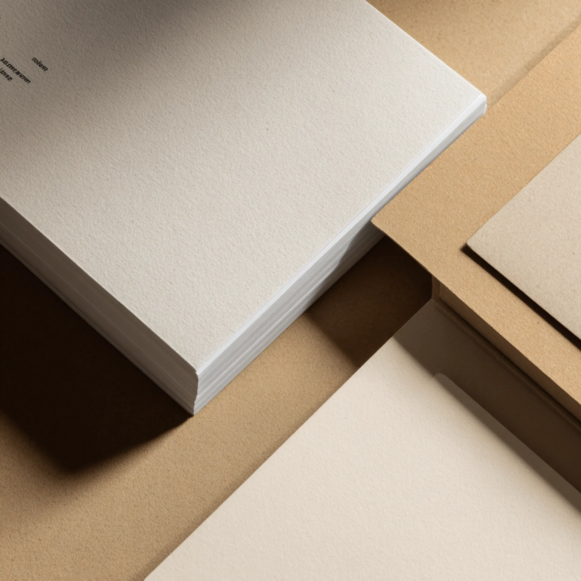
A book cover is not a flat image wrapped around pages. It is a manufactured component with its own materials, dimensions, tolerances, and finishing steps. Understanding the physical construction changes how you approach the design.
Softcover (Perfect Bound)
A softcover is a single sheet of cover stock — typically 10pt to 12pt C1S (coated one side) card stock — printed on the outside, scored at the spine folds, and wrapped around the text block during binding. The printed side faces out. The uncoated inside faces the first and last pages of the text block.
The cover sheet includes the front panel, the spine, and the back panel as a single continuous piece. The dimensions of each panel depend on the trim size, and the spine width depends on the page count and paper caliper of the interior stock. This is why you cannot finalize a cover design until the interior spec is locked — the spine width is derived from the interior, not chosen independently.
Hardcover (Case Bound)
A hardcover case is built from three rigid boards — a front board, a back board, and a spine strip — wrapped in a covering material. The covering material can be printed paper (a “printed case”), cloth, linen, leather, or specialty material. The boards are slightly larger than the text block on three sides (the “overhang” or “square”), and the text block is attached to the case through the endsheets.
If the hardcover uses a dust jacket, the case itself may be plain cloth or printed with a simpler design, and the jacket carries the full-color marketing artwork. If there is no dust jacket, the case covering material carries the design directly — via printing, foil stamping, debossing, or a combination.
Hardcover dimensions are calculated from the text block size plus board thickness and square. A dust jacket has its own separate dimensions that wrap around the case and include front and back flaps. Each component — case, jacket — requires its own file with its own template.
French Flap Softcover
A French flap softcover is a perfect-bound cover with extended front and back panels that fold inward, similar to a dust jacket’s flaps but integrated into the softcover itself. The cover sheet is wider than a standard softcover to accommodate the flaps, and the flaps are scored and folded during binding. French flaps require a heavier cover stock (typically 12pt to 14pt) to hold the fold without cracking.
Spine Width: The Dimension You Cannot Guess
Spine width is the single most common source of cover file errors. Designers estimate spine width from page count using rough formulas they find online, and those estimates are routinely wrong by enough to misalign the spine text or create visible wrapping errors on the finished book.
Spine width is determined by three factors:
- Page count — the number of interior pages (not sheets — one sheet has two pages).
- Paper caliper — the measured thickness of one sheet of the interior stock, in thousandths of an inch (points). Caliper varies between paper mills, between coated and uncoated stock, and between different weights of the same stock.
- Binding method — perfect binding adds a thin layer of adhesive. Smyth sewing adds thread bulk between signatures. Case binding adds endsheet and board-attachment materials.
We calculate spine width from the actual caliper of the paper you have selected, not from nominal basis weight. A “60lb uncoated offset” from one mill may caliper at 0.0046 inches per sheet while the same nominal weight from another mill calipers at 0.0050 inches. Over 300 pages, that difference produces a spine width discrepancy of more than a tenth of an inch — enough to visibly shift spine text off center.
Do not design the spine until we provide the calculated spine width. We include spine width in our cover template, which we generate after the interior spec (paper stock, page count, binding method) is confirmed.
The Cover Template
Every cover file should be built on a template that specifies exact dimensions. We provide cover templates as PDFs with labeled zones for each project after the interior spec is locked. Here is what the template defines:
Softcover Template Zones
- Front cover panel — trim width × trim height, plus bleed on three outer edges
- Spine — calculated spine width × trim height
- Back cover panel — trim width × trim height, plus bleed on three outer edges
- Bleed — 0.125 inches beyond the trim on all outer edges
- Safety margin — 0.25 inches inside the trim on all panels (keep all critical content — text, logos, barcodes — inside this line)
- Spine safety — 0.0625 inches inside each spine fold (spine text should not approach the fold lines, especially on narrow spines)
Hardcover / Dust Jacket Template Zones
Hardcover templates add:
- Board square — the overhang beyond the text block (typically 0.125 inches on head, foot, and fore-edge)
- Board wrap — the covering material extends beyond the boards and wraps around the edges (typically 0.625 to 0.75 inches)
- Hinge gap — a small gap between the spine strip and the front/back boards that allows the cover to flex open
Dust jacket templates add:
- Front flap — typically 3.5 to 4 inches wide
- Back flap — typically 3.5 to 4 inches wide
- Jacket spine — slightly wider than the case spine to account for material thickness over the boards
Each zone has its own safety margin. The template makes all of this explicit. Design to the template, not to estimated dimensions.
Color on Covers: What Changes Between Screen and Print
Cover color is one of the areas where the gap between what a designer sees on screen and what comes off the press is widest. Several factors contribute.
CMYK Gamut
Covers are printed in CMYK (cyan, magenta, yellow, black). The CMYK gamut is smaller than the RGB gamut your monitor displays. Saturated blues, vivid oranges, and electric greens that look brilliant on screen will compress when converted to CMYK. If your design relies on a color that sits outside the CMYK gamut, you will see a shift — sometimes subtle, sometimes dramatic.
Convert your design to CMYK early in the process, not as a last step before submission. If you design in RGB and convert at the end, you may discover that a key color has shifted in a way that changes the mood or legibility of the cover.
For colors that must match precisely — corporate brand colors, Pantone spot colors — note the target Pantone number in your file submission. We can evaluate whether the CMYK build is close enough or whether a spot color ink is needed (spot colors are an additional plate and are typically only cost-effective on offset runs above 500–1,000 units).
Lamination Effects on Color
Most softcovers and dust jackets receive a lamination layer — gloss, matte, or soft-touch matte. Lamination protects the printed surface from scuffing and moisture, but it also changes how colors appear:
- Gloss lamination deepens saturation and increases apparent contrast. Dark colors look richer. The cover surface is reflective and shows fingerprints.
- Matte lamination reduces saturation slightly and softens contrast. Colors appear more muted and natural. The surface is non-reflective and fingerprint-resistant.
- Soft-touch (velvet) matte lamination has a similar visual effect to standard matte but adds a tactile “suede” texture. It is the most fingerprint-resistant option and is popular for literary fiction, business books, and premium nonfiction.
If you are evaluating cover color, you need to see a proof with lamination applied — an unlaminated proof will not predict the final appearance. We can produce laminated proofs on request.
Ink Coverage and Drying
Covers with heavy ink coverage — dark backgrounds, full-bleed photography, large solid-color fields — require attention to ink density and drying. Excessive ink coverage on cover stock can cause set-off (wet ink transferring to the inside of the adjacent cover during stacking), cracking at the spine fold, or adhesion problems with lamination.
We manage ink density during prepress, but designers should be aware that a solid black cover does not print as 100% K (black ink only). Rich black, which adds cyan, magenta, and/or yellow under the black to produce a deeper, more neutral black, is standard for large black fields on covers. Our prepress team sets the rich black build for the specific stock and press conditions. If you are specifying a background color, provide the intended CMYK values and note whether the black fields should be rich black.
Typography on Covers
Legibility at Thumbnail Size
Your cover will be seen at roughly 1 × 1.5 inches on a retailer’s website before it is ever seen at full size. The title must be legible at thumbnail scale. This is a simple test: export your cover design as a JPEG at 150 pixels tall and look at it. If you cannot read the title instantly, the typography is not working for online retail.
Common thumbnail-legibility failures:
- Script or decorative fonts with thin strokes that disappear at small sizes
- Low contrast between title text and background image
- Title placed in a small area of the cover while a large image dominates
- Subtitle or author name competing with the title at similar visual weight
Font Embedding and Outlining
Every font used in the cover file must be either embedded in the PDF or converted to outlines (vector paths). If a font is not embedded and not available on our system, the PDF renderer will substitute a default font — and the substitution will be wrong.
Converting to outlines is the safest approach for cover files because covers typically contain a small number of text elements. Outlining eliminates any font-availability dependency entirely. The tradeoff is that outlined text cannot be edited after conversion, so keep a working file with live text and produce the outlined PDF as your final print-ready output.
Spine Text
Spine text runs from top to bottom on the spine panel (in the English-language convention — some markets read bottom to top). On a narrow spine (under 0.35 inches), spine text is extremely constrained. Use a clean sans-serif font at the smallest size that remains legible, and center the text vertically and horizontally on the spine width.
For spines under 0.25 inches (approximately 80 pages or fewer on standard stock), we recommend omitting spine text entirely. Text on a spine this narrow will appear cramped and may shift visibly off center due to normal binding tolerances.
Barcode and ISBN Placement
Barcode Specifications
Retail books require a Bookland EAN barcode derived from the ISBN. The barcode must be:
- Printed at a minimum height of 1 inch (including human-readable numerals below the bars)
- Placed on the back cover, typically in the lower-right quadrant
- Surrounded by a white (paper-color) quiet zone of at least 0.125 inches on all sides — the quiet zone must be genuinely clear of any design element, image, or text
- Printed in black on white for reliable scanning — colored barcodes or barcodes placed over images may not scan correctly
Price and ISBN
If your book will carry a printed price, the price extension is encoded in a smaller supplemental barcode to the right of the main barcode. In the US market, this is a five-digit add-on representing the price in cents (for example, “51595” for $15.95). If you do not want a printed price (common for books sold primarily online or for books where the price may change), you can use the “90000” no-price code.
The barcode file is generated from your ISBN. If you purchased your ISBN through Bowker, you can generate the barcode through their system. We can also generate the barcode for you if you provide the ISBN and pricing information. For more on ISBN registration, see our ISBN guide.
Back Cover Layout
The back cover carries the barcode, but it also carries marketing content — synopsis, endorsement quotes, author photo, category line, and publisher logo. The design challenge is fitting all of this into a single panel without crowding.
A well-organized back cover establishes a clear hierarchy: synopsis text (the largest block), one to three short endorsement quotes, a small author photo or bio line, and the barcode in the lower-right corner. Leave the lower-right quadrant clear for the barcode from the beginning of the design process — do not try to place the barcode after the layout is finished.
Cover Finishing Options
Finishing decisions are part of the cover design because they change how the printed result looks, feels, and performs. Specify finishing in your project brief alongside the design file.
Lamination
Lamination is applied to the printed cover as a thin film layer. It serves two purposes: protecting the printed surface and modifying the visual and tactile quality. Nearly all softcovers and dust jackets are laminated. The options are gloss, matte, and soft-touch matte (described in the color section above).
Spot UV
Spot UV is a clear, high-gloss coating applied to specific areas of the cover — typically the title text, a logo, or an image element — while the rest of the cover remains matte-laminated. The contrast between the matte surface and the glossy UV creates a visual and tactile effect. Spot UV requires a separate file (a “mask” layer) that defines exactly where the UV is applied.
Spot UV alignment has a tolerance of approximately 0.5mm, so very fine details (thin text, intricate patterns) may not register precisely to the underlying print. Design spot UV elements with clean, bold shapes for the best result.
Foil Stamping
Foil stamping presses a metallic or pigment foil onto the cover surface using a heated die. It produces a reflective or textured mark that cannot be achieved with ink alone. Foil is common for titles on hardcover cases, for premium softcover accents, and for limited-edition finishing.
Foil stamping requires a custom die, which has a one-time cost. The die is reusable for future runs. Foil is applied as a separate operation after printing and lamination, so it adds production time. Fine detail in foil (text under 8pt, thin serifs, hairline rules) may not stamp cleanly — test your design against foil stamping’s physical resolution limits.
Embossing and Debossing
Embossing raises an area of the cover surface. Debossing presses an area into the surface. Both are produced with a custom die and are applied without ink (blind emboss/deboss) or over a foil stamp for a combined foil-and-relief effect.
Embossing and debossing work best on heavier cover stocks and are most commonly used on hardcover cases. On thin softcover stock, the relief may not hold well and can be visible on the inside of the cover as an inverse impression.
Common Cover File Errors
These are the errors we see most frequently in cover file submissions, ranked roughly by how often they occur:
-
Spine width calculated from an online formula instead of actual paper caliper. The cover wraps incorrectly — spine text shifts, fold lines are misplaced, and the front/back panels appear asymmetric.
-
No bleed or insufficient bleed. The cover design goes to the edge of the trim but does not extend 0.125 inches beyond it. After trimming, a thin strip of unprinted paper appears along one or more edges.
-
RGB color space submitted instead of CMYK. Colors shift during the printer’s conversion — often toward duller or differently hued results than the designer intended.
-
Fonts not embedded or outlined. Text reflows with a substituted font, changing the layout and often the visual character of the design entirely.
-
Barcode placed over a colored or image background. The barcode will not scan reliably. It needs a clear white quiet zone.
-
Safety margin violations — critical content too close to the trim or spine fold. Text or images that are “just inside the line” on the file may be partially cut after trimming, which has a tolerance of approximately 1/32 inch.
-
Spot UV file not aligned to the cover file. The UV prints offset from the intended elements, creating a misregistered glossy effect that looks like an error.
-
Cover designed at a resolution below 300 DPI. The design looks fine on screen but prints soft, especially on photographic backgrounds or detailed illustrations.
-
Rich black not used for large black fields. Single-color black (100K, 0C/0M/0Y) prints as a dark gray on cover stock. Rich black (typically 60C/40M/40Y/100K, though the exact build varies) produces the deep, neutral black the designer intended.
-
Spine text on a spine that is too narrow to support it. The text is technically present but is illegible, cramped, or visually off-center due to normal binding tolerances.
Cover File Submission Checklist
- Cover file built on the template we provided (not estimated dimensions)
- Spine width matches the calculated value from our template (not an online estimate)
- File format is PDF/X-1a or PDF/X-4
- Resolution is 300 DPI throughout
- Color space is CMYK with embedded ICC profile
- All fonts embedded or converted to outlines
- Bleed is 0.125 inches on all outer edges
- All critical content (text, logos, barcode) within the safety margin (0.25 inches from trim)
- Spine text centered within spine safety zone (or omitted if spine is under 0.25 inches)
- Barcode placed on back cover with white quiet zone, minimum 1 inch height
- ISBN and price extension confirmed and encoded in barcode
- Lamination type specified (gloss, matte, soft-touch matte)
- Spot UV mask file provided as a separate layer or file (if applicable)
- Foil stamping die art provided as a separate vector file (if applicable)
- Rich black build used for large black fields (not 100K alone)
- Cover reviewed at thumbnail size (150px tall) for title legibility
- Separate files provided for dust jacket and case (hardcover projects)
- French flap dimensions confirmed and fold lines marked (if applicable)
Working With a Cover Designer
If you are hiring a cover designer, the best thing you can do for the production process is make sure the designer receives our cover template before they begin working. A talented designer who builds to estimated dimensions will produce a file that needs to be reworked. A competent designer who builds to the actual template will produce a file that is print-ready on submission.
When briefing your designer, provide:
- The cover template from us (with exact dimensions, spine width, and zone markings)
- Your interior trim size and page count
- The binding method and cover construction (softcover, hardcover case, dust jacket, French flaps)
- Lamination preference
- Any finishing (spot UV, foil, emboss/deboss) so the designer can plan for those elements
- Barcode placement requirements and the ISBN/price information
- Genre and comparable titles — not for the designer to copy, but to establish the visual vocabulary your audience expects
The designer handles the aesthetics. We handle the production specs. When both sides work from the same template, the result is a cover that looks right and prints right on the first run.
Cover Design by Genre
Genre conventions exist because they work — they signal to readers what kind of book they are looking at before they read a single word. Breaking conventions deliberately can be effective; breaking them accidentally signals that the publisher does not understand the market.
We do not provide design services, but we work with covers across every genre and see the patterns that sell and the patterns that create production problems. A few notes on common genre-specific production considerations:
Fiction (literary, mystery, thriller, romance, SFF) — Fiction covers are image-driven and rely on mood, color palette, and typography to convey genre. The main production consideration is ensuring that photographic or illustrated backgrounds maintain quality at 300 DPI and that dark or complex backgrounds do not compromise title legibility at thumbnail size.
Nonfiction (business, self-help, memoir) — Nonfiction covers tend to be more typography-driven, with bold title treatments and cleaner layouts. The production consideration is ensuring that the typographic hierarchy reads clearly on the spine as well as the front cover — nonfiction spines often carry title, subtitle, and author name, which requires careful spacing on the available spine width.
Children’s and picture books — Full-wrap illustrated covers that extend across front, spine, and back as a single continuous image. The production consideration is ensuring the illustration handles the spine fold and back-cover barcode placement without disrupting the artwork. Illustrators should design with the spine zone and barcode zone masked from the start.
Coffee table, art, and photography books — Covers are often the first and most prominent image in the book. Lamination choice (gloss vs. matte vs. silk) directly affects how the cover image appears. Proofing with lamination applied is essential for these categories.
For genre-specific production guidance, see our genre printing pages.
Related Resources
- Paper stock guide — how paper selection affects cover stock options, spine width, and color reproduction
- Binding options guide — how binding method determines cover construction (softcover wrap, case build, dust jacket)
- Color management guide — ICC profiles, CMYK conversion, and proofing workflows
- Manuscript preparation guide — interior file preparation that determines the specs your cover design must match
- ISBN guide — ISBN registration, barcode generation, and price encoding
Next Steps
- Need a cover template? Send us your interior spec — trim size, page count, paper stock, and binding method — and we will generate a cover template with exact dimensions, spine width, and all zone markings.
- Have a cover file ready? Submit it for preflight — we will check dimensions, bleed, color space, font embedding, barcode, and resolution before the file enters production.
- Choosing finishing? Request cover stock and lamination samples — see and feel the difference between gloss, matte, and soft-touch on the actual stock your cover will be printed on.
- Working with a designer? Share this guide and our cover template with them. A designer working from the correct template produces a print-ready file. A designer working from estimates produces a file that needs revision.