Mystery & Thriller Book Printing
Matte softcovers, cream interiors, and spine-matched series runs — printed for the genre where readers buy the backlist the moment they finish book one.
Built for How Mystery and Thriller Fiction Actually Sells
Spine-Matched Series Production
We store trim, paper caliper, cover finish, and spine width data from every order so book 12 matches book 1 — even years later, even on a different run size.
Matte Lamination Standard
The understated, low-glare matte finish that dominates mystery and thriller covers. Resists scuffing at signings, photographs without glare for social media, and signals genre on the shelf.
Hardcover for Libraries and Signed Editions
Case-bound hardcovers with optional foil stamping for library acquisitions, signed first editions, and premium releases where shelf durability matters.
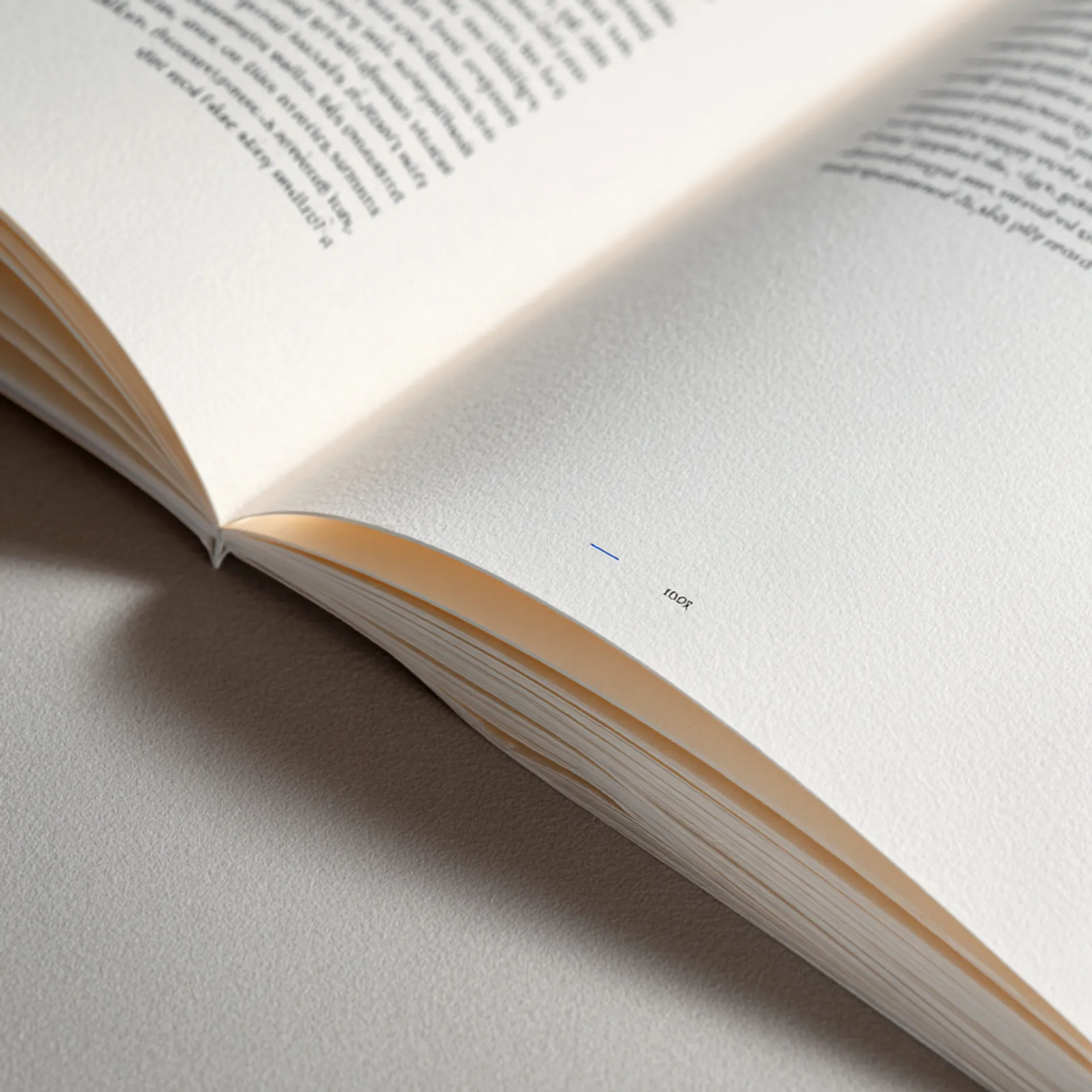
Cream Stock, Calibrated Ink Density
Mystery and thriller interiors print on 60lb cream uncoated — the genre standard. We calibrate ink density at press setup to prevent show-through without sacrificing the sharp type contrast long-form fiction demands.
Who This Page Is For
This page is for mystery authors, thriller writers, suspense novelists, indie publishers, and hybrid presses printing softcover novels, hardcover library editions, or multi-volume series in runs of 25 to 5,000 copies. Whether you are producing a standalone psychological thriller, a cozy mystery series at volume 14, or a signed hardcover first edition, the production guidance here applies.
Mystery and thriller fiction is the second-highest-selling genre in commercial publishing and one of the most physically consistent. Readers expect a specific set of production signals: matte covers, cream paper, readable serif type, and a spine that lines up with the rest of the series on a shelf. Get those details right and the book disappears into the reading experience. Get them wrong — glossy lamination, white paper, an inconsistent spine — and the book feels off before the reader opens chapter one.
This page explains what actually changes in manufacturing when you print mystery and thriller fiction, where production failures occur, and how to spec your files to avoid them.
What Changes in Production for Mystery and Thriller
Mystery and thriller novels look straightforward to manufacture — black-and-white text on cream stock with a matte softcover. But the genre’s production demands are specific in ways that matter to readers who buy dozens of physical books a year and shelve them spine-out.
Matte Covers on Dark Color Palettes
Mystery and thriller covers skew dark. Black backgrounds, deep navy, charcoal, blood red. These are the colors that sell suspense on a shelf — and they are also the colors that expose every production flaw in a matte-laminated cover.
Standard matte lamination shows fingerprints, scuff marks, and handling wear more visibly on dark covers than on any other palette. A box of 500 books that looked perfect leaving the bindery can arrive at an author event with surface marks from stacking and transit.
We address this two ways. First, we default to a soft-touch matte film rather than standard matte for mystery and thriller covers. Soft-touch resists surface marking significantly better and adds a tactile quality — a subtle velvet texture — that readers notice when they pick up the book. Second, for authors doing high-volume event sales or shipping to retail, we can apply a scuff-resistant overcoat that adds an additional layer of protection without changing the visual finish.
The production tradeoff: soft-touch matte costs slightly more per unit than standard matte. For most mystery and thriller authors, it is worth it because dark covers are the genre norm, not the exception.
Cream Stock and Show-Through Control
Mystery and thriller interiors print on cream (natural) uncoated paper. Cream reduces eye fatigue during long reading sessions, gives the page a warmer tone than white, and adds roughly 8–12% bulk compared to white stock at the same weight — meaning a thicker spine and more shelf presence.
The production risk on cream stock is ink show-through. Cream uncoated paper has lower opacity than white coated sheets. On a 300-page thriller printed at standard ink density, show-through — where text from the reverse side is faintly visible through the page — is a real possibility, especially on lighter-weight stocks.
The fix is not heavier paper. Moving from 60lb to 70lb cream increases cost and changes spine width, which forces a cover template revision and breaks series consistency. Instead, we calibrate ink density at press setup: enough saturation for sharp, high-contrast type, but controlled enough to prevent bleed-through on 60lb cream. We verify this on the first press sheets of every fiction run before the full production proceeds.
Series Consistency Across Volumes
Mystery and thriller fiction is heavily series-driven. A reader who finishes book one of a detective series will frequently buy the entire backlist — and line them up spine-out on a shelf. Spine inconsistency between volumes (different widths, color drift, misaligned title text) is one of the most common complaints from series authors and their readers.
Spine width is controlled by three variables: page count, paper caliper, and binding adhesive thickness. Page count changes between volumes — a 280-page book followed by a 340-page book. Paper caliper varies between mill lots, sometimes by thousandths of an inch per sheet, which compounds across hundreds of pages. Adhesive application has a tolerance range that adds or subtracts fractions of a millimeter.
We manage this by storing the exact paper caliper, spine width calculation, and cover template from every previous volume in your series. When a new volume enters production, we pull the stored data, measure the incoming paper lot, and adjust the spine template before generating the cover wrap. If the caliper has shifted enough to produce a visible width difference at the new page count, we flag it and recommend a paper substitution from the same mill family before proceeding.
For authors switching to Origin Books mid-series, we can spec-match your existing volumes. Send us a physical copy from a previous print run, and we will measure and replicate the specs.
Hardcover Editions for Libraries and Signed Copies
Mystery and thriller hardcovers serve two distinct markets: library sales and signed/collector editions.
Libraries prefer hardcover for circulating fiction because it survives repeated checkouts. A Smyth-sewn case-bound hardcover will circulate 50–100 times before the binding fails; a perfect-bound softcover may last 15–20 circulations. For authors distributing through library channels (Baker & Taylor, Ingram, direct sales to library systems), hardcover is the expected format.
Signed first editions are a growing segment in mystery and thriller. Readers and collectors value hardcover first editions of debut novels and series openers. Foil stamping on the cover or spine — a metallic title, an author signature — adds perceived value without adding significant per-unit cost at quantities above 100.
The production consideration for mystery hardcovers is restrained finishing. Unlike romance collector editions, where readers expect maximalist production (stained edges, ribbon markers, elaborate endsheets), mystery and thriller readers generally prefer a cleaner aesthetic: foil on the title or spine, a matte dust jacket, and quality binding. The production signals should say “this is a serious book” rather than “this is a decorative object.”
Typical Specs for Mystery and Thriller
Standard Softcover
| Spec | Recommended | Notes |
|---|---|---|
| Trim size | 5.5 × 8.5 in or 6 × 9 in | 5.5 × 8.5 is the genre standard; 6 × 9 is common for literary thrillers and trade crossover titles |
| Binding | Perfect bound (PUR adhesive) | PUR is stronger than EVA and allows the book to open flatter — important for 300+ page thrillers |
| Interior paper | 60lb cream uncoated | 50lb cream for high-page-count titles (400+ pages) to control spine width and book weight |
| Cover stock | 12pt C1S with soft-touch matte lamination | 10pt is acceptable but more prone to curl, especially on dark covers |
| Spine text | Minimum 150 pages for readable spine text | Below 100 pages, spine text is not recommended |
| Interior color | Black-and-white | Grayscale maps, chapter-opener illustrations, and section dividers print at no extra cost |
Hardcover (Library/Signed Edition)
| Spec | Recommended | Notes |
|---|---|---|
| Trim size | 5.5 × 8.5 in or 6 × 9 in | Match softcover trim if both formats exist for the same title |
| Binding | Smyth-sewn case bound | Smyth sewing is stronger and opens flatter than perfect-bound hardcovers; essential for library durability |
| Interior paper | 60lb cream uncoated | Match the softcover edition paper for production consistency |
| Case cover | Printed wrap with matte lamination | Optional foil stamping on title and/or spine for signed editions |
| Dust jacket | Matte lamination with optional Spot UV on title | Clean, dark design with restrained finishing |
| Endsheets | White or black uncoated | Printed endsheets (maps, character lists) are optional but add value for series |
Common Mistakes We See
- Spine width calculated from page count alone. Spine width depends on paper caliper, not just page count. A 320-page book on 60lb cream has a different spine than a 320-page book on 50lb cream. Always calculate from actual caliper data — use our spine calculator.
- Dark cover art designed without accounting for lamination color shift. Matte lamination slightly darkens cover colors. A cover that looks perfect on screen may print darker than expected, crushing shadow detail in already-dark mystery artwork. Request a physical press proof for dark covers.
- Cover designed without bleed. Covers require 0.125” bleed on all sides. Missing bleed results in white edges after trimming — visible and unprofessional.
- Interior gutter margins too narrow. Perfect binding consumes 0.25–0.375” of the gutter margin. Interior text margins should be at least 0.75” on the gutter side (0.875” for books over 300 pages). Tight gutters make the book physically difficult to read.
- Inconsistent trim sizes across a series. Switching from 5.5 × 8.5 to 6 × 9 mid-series creates a mismatch on the shelf. Choose a trim size at book one and maintain it.
- RGB color mode in cover files. Cover files must be CMYK. RGB-to-CMYK conversion shifts colors — particularly blacks and dark blues, which are the backbone of mystery cover design. A rich black in RGB can convert to a muddy dark gray in CMYK if not handled correctly.
Preflight Checklist
Before submitting files for a mystery or thriller, verify:
- Interior PDF is single-page (not spreads), with pages in sequential order
- All fonts are embedded in both the interior and cover PDFs
- Cover PDF includes 0.125” bleed on all sides and spine width matches our template
- Interior gutter margin is at least 0.75” (0.875” recommended for 300+ pages)
- Page count is final — changes after proof approval require a new cover template and spine recalculation
- For series: confirm trim size, paper stock, and cover finish match previous volumes
- Cover color mode is CMYK; verify rich black values (we recommend 60C/40M/40Y/100K for deep blacks)
- Grayscale interior images are 300 DPI minimum; line art is 1200 DPI
- ISBN barcode is placed on the back cover per retail requirements
- Back matter includes an also-by list if this is part of a series
How a Mystery/Thriller Project Moves Through Production
1. File Intake and Spec Confirmation
You submit interior and cover PDFs through our upload portal. For series titles, we pull your stored specs from previous volumes and confirm the new book matches. For new projects, we confirm trim size, paper stock, binding method, and finishing options before preflight begins.
Genre-specific checkpoint: We verify cream vs. white stock selection, confirm spine width against actual paper caliper for the incoming lot, and check that dark cover colors will reproduce accurately under matte lamination. If your cover relies on fine detail in shadow areas (common in thriller cover photography), we flag it for a lamination preview.
2. Preflight and Proofing
Our preflight process checks resolution, bleed, margins, font embedding, and color mode. For mystery and thriller covers, we pay particular attention to black values in CMYK — the difference between a flat black (0/0/0/100) and a rich black (60/40/40/100) is dramatic on a dark matte cover, and many files arrive with the wrong black build.
You receive a digital proof for approval. For dark or color-critical covers, we strongly recommend a physical press proof (adds 3–5 business days). The press proof is printed on your actual cover stock with your actual lamination, so the proof you approve is the product that ships. This matters more for mystery and thriller covers than for most genres because the dark palettes amplify any color deviation.
Genre-specific risk: Ink show-through on cream stock. We run a show-through test at press setup, checking both sides of the sheet under transmitted light, and adjust ink density before the full run proceeds.
3. Binding and Finishing
Standard softcovers go through PUR perfect binding, three-knife trimming, and matte lamination. Turnaround for softcover-only orders is typically 10–12 business days from proof approval.
Hardcover editions add case-making, Smyth sewing (or notch binding for shorter runs), and optional foil stamping on the cover or spine. Dust jackets are printed separately, laminated, and wrapped. Hardcover turnaround is typically 15–18 business days from proof approval.
Genre-specific risk: Spine cracking on thick thrillers. Books above 400 pages with PUR perfect binding can develop spine cracking if the cover stock is too rigid or the adhesive application is too thin. We adjust adhesive volume for thick books and recommend 12pt C1S over heavier boards to allow spine flex.
4. Packaging and Fulfillment
Finished books are shrink-wrapped in packs of 5 or 10, then boxed. Hardcovers with dust jackets are individually wrapped to prevent jacket scuffing in transit.
We ship to your address, your distributor, or multiple locations. For authors selling at conventions, mystery festivals (Bouchercon, ThrillerFest, Left Coast Crime), or bookstore events, we can pack in event-ready quantities that match your typical order size.
Genre-specific consideration: Mystery and thriller authors frequently sell at genre conventions where speed matters. If you need books by a specific event date, work backward from that date and add 5 business days of buffer. We offer rush production when timelines are tight.
Design and File Preparation
Cover Design by Subgenre
Mystery and thriller covers are genre-coded. Readers identify subgenre visually before reading the title or blurb. A cover that sends the wrong signal — or no signal at all — will underperform regardless of the writing.
Cozy mystery: Illustrated covers with bright, warm palettes. Hand-lettered or playful serif typography. Often features a setting (bakery, bookshop, village) or an animal character. Cozy covers are the lightest palette in the genre and the most forgiving in print — fewer dark-cover production concerns.
Police procedural / detective: Photographic covers with urban settings, high-contrast lighting, and desaturated color. Sans-serif or slab-serif typography in white or metallic tones. Dark backgrounds are standard.
Psychological thriller: Minimal, high-concept covers. Often a single image (a house, a figure, a window) in a muted palette with bold sans-serif title typography. Negative space and implied threat drive the design.
Legal / political thriller: Conservative design with strong typography. Dark backgrounds, metallic foil on the title, authoritative serif or sans-serif fonts. These covers signal “serious” and “institutional.”
Domestic suspense: Softer palette than psychological thriller — muted pastels, blurred photography, handwritten-style title fonts. These covers bridge the gap between thriller and book club fiction.
Hardboiled / noir: The darkest covers in the genre. Black backgrounds, minimal color (often a single red or gold accent), distressed textures, and bold sans-serif type. Foil and Spot UV work well in this subgenre for adding physical texture to an otherwise stark design.
Interior Formatting
Mystery and thriller interiors follow a consistent standard:
- Font: Serif typeface, 11–12pt, with comfortable leading. Garamond, Caslon, Minion Pro, and Palatino are common in the genre. Avoid decorative fonts for body text — readability is paramount in long-form fiction.
- Margins: 0.75–1” on all sides, with the gutter margin increased to 0.875–1” for books over 250 pages. Readers hold mystery novels for long sessions; comfortable margins reduce hand fatigue.
- Chapter openings: Drop caps, small caps on the first line, or a simple centered chapter number are standard. Ornate chapter openers are less common in the genre than in romance or fantasy.
- Scene breaks: Centered ornament, a simple line, or three asterisks. Be consistent throughout. Scene breaks are frequent in thrillers with multiple POV characters.
- Front matter: Title page, copyright page, dedication (optional), epigraph (common in the genre — a quote that sets the tone).
- Back matter: Acknowledgments, about the author, also-by list, excerpt from the next book in the series. The also-by list and next-book excerpt are critical for series fiction because backlist sales are driven by the end of the current book.
For authors preparing files independently, we provide templates and a spine width calculator. Full specs are in the file preparation guide.
Spec Downloads and Tools
We provide production tools designed for mystery and thriller printing workflows:
- Cover template generator — Enter your page count and paper stock, get a cover template with exact spine width, bleed marks, and safe area guides. Available as PDF and Adobe Illustrator files.
- Spine width calculator — Calculate spine width from page count and paper caliper. Includes series comparison mode for matching new volumes to existing spines.
- Mystery/thriller preflight checklist — Downloadable checklist covering submission requirements specific to dark matte covers, cream stock interiors, and series production.
- Rich black CMYK guide — Reference for building deep, consistent blacks in CMYK for dark thriller covers. Includes recommended values for solid black, near-black, and gradient-to-black builds.
- Paper sample kit — Request physical samples of our cream and white uncoated stocks in the weights used for fiction printing. See and feel the paper before committing to a stock.
These tools are available in our Resources section. Designers who work with our templates submit production-ready files at a higher rate, which means fewer preflight cycles and faster turnaround.
Trust Signals
Production volume: Origin Books prints mystery and thriller titles for indie authors, hybrid presses, and small publishers across every subgenre — cozy to hardboiled, standalone to 15-volume series. We produce both standard softcover runs and hardcover library and signed editions.
Series management: We maintain production records for multi-volume series, including paper caliper history, spine width calculations, and cover specifications from every previous order. Authors printing volume 12 of a detective series get the same consistency controls as volume 1.
Bindery capability: Foil stamping, 3D Spot UV, soft-touch matte lamination, and case binding are performed in-house — not subcontracted. This gives us direct control over registration, finish quality, and turnaround.
Finishing equipment: Kluge foil stamping press, UV coating line, and three-knife trimmer with digital measurement — the same bindery equipment used by trade publishers for premium editions.
Genre conventions served: We have shipped books to Bouchercon, ThrillerFest, Left Coast Crime, Malice Domestic, and regional mystery festivals. We understand event-driven production timelines.
For the full selection of paper options, binding methods, and finishing techniques, see Paper and Materials and Binding Options.
Next Steps
Ready to print? Request a quote with your trim size, page count, quantity, and finishing preferences. If you are printing a series, include the volume number and we will pull your stored specs.
Need templates? Download cover templates and the spine calculator to prepare production-ready files.
Have production questions? Talk to our production team — not a sales team. You will speak with someone who understands bindery, paper, and press.
Mystery & Thriller Printing — Production FAQ
Why does my spine width change between volumes in a series?
Spine width is a function of page count, paper caliper, and binding adhesive thickness — not page count alone. Paper caliper varies between mill lots, sometimes by 0.001–0.002 inches per sheet, which compounds across 300 pages into a visible difference. Origin Books measures caliper on every incoming paper delivery and adjusts spine templates before platemaking. We also store your historical spine data across volumes so we can flag drift before it reaches press.
Can you match a previous print run from another printer?
Usually, yes. We need a physical copy from the original run plus the original cover and interior PDFs. We measure the existing book — paper caliper, trim, spine width, cover lamination type, and ink density — then spec-match or recommend the closest equivalent stock in our inventory. If the original printer used a proprietary stock, we disclose the difference before you approve the proof.
My thriller has a few interior maps or chapter illustrations. Does that change the production approach?
Scattered grayscale illustrations print at no additional cost on a black-and-white interior. The key variable is resolution: line art needs 1200 DPI, grayscale images need 300 DPI minimum. We check resolution during preflight and flag anything below threshold. If your interior has more than a handful of images, we recommend reviewing ink coverage to avoid show-through on cream stock.
Why do dark matte covers show fingerprints and scuff marks?
Standard matte lamination is more susceptible to surface marking than gloss, and dark covers — blacks, navy, deep burgundy — make every mark visible. We default to a soft-touch matte film that resists fingerprints and scuffing significantly better than standard matte. For authors doing high-volume event signing, we can also apply a scuff-resistant overcoat.
What is the most cost-effective way to print a mystery series backlist restock?
Backlist restocks are almost always digital runs in the 100–250 range. At that quantity, there are no plate charges, and the unit cost difference versus offset is minimal for B&W interiors. The key to cost control is keeping your specs standard: 5.5 × 8.5 or 6 × 9 trim, 60lb cream, matte softcover. Non-standard trims or paper stocks require press changeover, which adds cost on short runs.
Should I print hardcover or softcover for a library edition?
Libraries strongly prefer hardcover for circulating fiction because it survives repeated checkouts. A case-bound hardcover with Smyth-sewn binding will outlast a perfect-bound softcover by a factor of 5–10x in library use. If you are targeting library sales through distributors like Baker & Taylor or Ingram, hardcover is the expected format. Softcover is fine for direct library sales at author events or local systems.