Science Fiction & Fantasy Book Printing
High page counts, interior maps, stained edges, and foil-stamped collector hardcovers — printed for the genre where readers shelve every volume spine-out and notice when book four does not match book one.
Built for How Science Fiction and Fantasy Actually Ships
Spine-Matched Series Production
We store trim, paper caliper, cover finish, and spine width data from every volume so book seven matches book one — even years later, even on a different run size, even when page count jumps by 150 pages between installments.
Interior Maps and Art on Mixed Stock
Full-page maps, frontispieces, and chapter-opener illustrations printed in black-and-white on text stock or in full color on coated inserts — bound flush into the text block without trim inconsistency.
Collector Edition Finishing
Foil stamping, stained edges, ribbon markers, printed endsheets, 3D Spot UV, and metallic printing — the full production toolkit for special editions and Kickstarter reward tiers.
High Page Count Engineering
SFF novels routinely hit 400–600 pages. We manage the spine width math, paper weight selection, and binding adhesive volume that thick books require to open properly and not crack at the spine.
Who This Page Is For
This page is for science fiction authors, fantasy writers, SFF publishers, hybrid presses, and Kickstarter creators printing softcover novels, hardcover editions, collector specials, or multi-volume series in runs of 25 to 5,000 copies. Whether you are producing a standalone space opera, a six-book epic fantasy series, a limited foil-stamped collector edition for a crowdfunding campaign, or a debut novel with a foldout map, the production guidance here applies.
Science fiction and fantasy is the most production-intensive genre in fiction printing. SFF novels are longer than average (350–600 pages is normal), frequently include interior art (maps, frontispieces, chapter illustrations), demand rigid series consistency across volumes that may span a decade of publication, and support a collector market that expects finishing quality — foil, stained edges, printed endsheets, ribbon markers — that most fiction genres do not. A mystery novel needs a matte cover and cream paper. A fantasy collector edition needs all of that plus foil stamping, custom endsheets with a world map, stained edges, a ribbon marker, and a case wrap that exactly matches the aesthetic of the three previous volumes.
This page explains what actually changes in manufacturing when you print SFF, where production failures occur, and how to spec your files to avoid them.
What Changes in Production for Science Fiction and Fantasy
SFF printing is not “fiction printing with extras.” The genre introduces production variables at every stage — paper selection, spine engineering, interior art handling, binding method, and finishing — that compound in ways other genres do not encounter. A 500-page fantasy novel with a two-page map insert, foil-stamped hardcover, printed endsheets, and stained edges involves more production steps than most illustrated nonfiction.
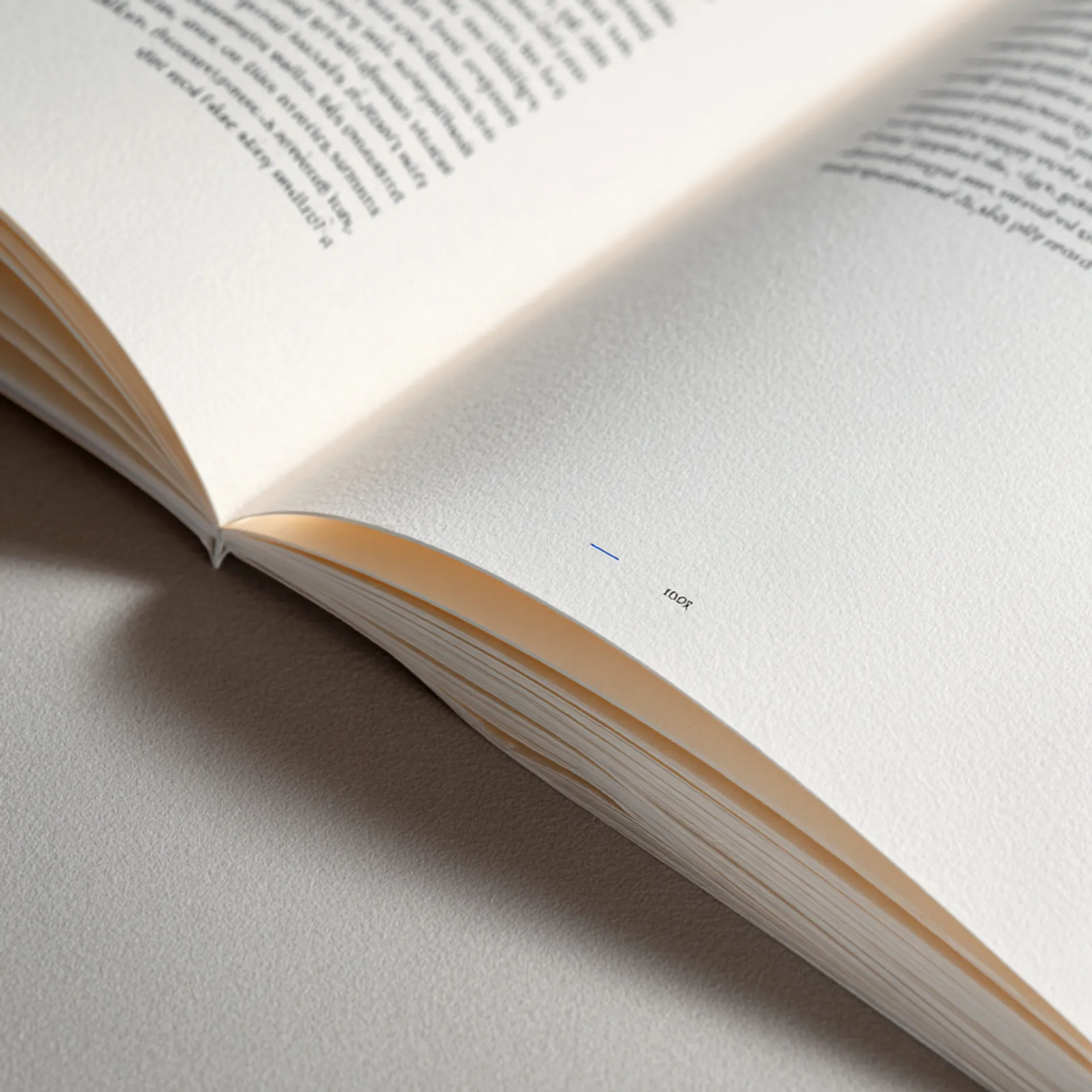
High Page Counts and Spine Engineering
SFF novels are long. A 400-page book is normal. A 500-page book is common. A 600-page book is not unusual. Page count has cascading production consequences that most authors and designers do not anticipate.
Spine width. A 500-page novel on 60lb cream uncoated produces a spine approximately 1.1 inches wide. At this width, the spine becomes a significant design surface — title, author name, series number, and publisher logo all need to fit legibly. More importantly, the cover template must be calculated from actual paper caliper, not from a generic pages-to-spine formula, because a 0.001-inch caliper variance per sheet compounds across 500 pages into a visible spine width error.
Binding stress. Thick perfect-bound books experience more spine stress when opened than thin ones. A reader opening a 500-page paperback applies significant leverage to the binding. Standard EVA hot-melt adhesive can crack or become brittle under this stress, especially in cold environments (convention halls, winter shipping). We use PUR (polyurethane reactive) adhesive for all SFF softcovers above 300 pages. PUR remains flexible after curing, which means the spine flexes with the reader rather than cracking.
Cover stock selection. For thick books, cover stock must flex with the spine. A 14pt C1S cover board that works fine on a 200-page literary novel will resist flexing on a 500-page fantasy epic, causing the spine to crease or the lamination to crack along the spine fold. We spec 12pt C1S for books above 400 pages — enough rigidity for shelf presence, enough flexibility for spine integrity.
Paper weight tradeoffs. Heavier paper (70lb) produces a bulkier book with a wider spine — more shelf presence, which SFF readers value. But it also increases weight, shipping cost, and the mechanical stress on the binding. Lighter paper (50lb) produces a thinner, lighter book but can increase show-through, especially with fantasy novels that use heavy black ink for decorative chapter openers. The standard for SFF fiction is 60lb cream uncoated — the balance point between bulk, opacity, and binding durability.
Interior Maps and Illustrations
Maps are a defining feature of fantasy publishing. They establish the world before the reader encounters chapter one. Science fiction novels less frequently include maps but may feature technical diagrams, star charts, or chapter-opener illustrations. In both cases, interior art introduces production variables that straight text does not.
Line art resolution. Maps and technical illustrations are typically line art — fine black lines on a white or cream background. Line art requires 1200 DPI to print cleanly. At 300 DPI (which is sufficient for photographic images), line art prints with visible jagged edges, soft corners, and broken fine lines. This is the single most common production failure in SFF interior art. Authors and designers who are accustomed to working at screen resolution submit maps at 150–300 DPI, and the printed result is visibly blurry. We check resolution on every interior image during preflight and flag anything below threshold.
Grayscale vs. color maps. Black-and-white or grayscale maps print on the text stock alongside the narrative at no additional cost. This is the most common and cost-effective approach — a full-page B&W map at the front of the book on cream paper, printed as part of the regular text block. Color maps require either a separate insert section on coated stock (cost-effective for 2–4 color pages) or a hybrid digital workflow that prints color pages inline with B&W pages (more flexible but more expensive per page).
Map placement and binding margins. A full-page map that runs into the gutter is unreadable. The binding margin consumes 0.25–0.375 inches of the page (more on thick books). Map designers must account for this lost space — critical terrain, city names, or legend text placed in the gutter will be swallowed by the binding. For two-page spread maps (the classic fantasy fold-out), alignment across the gutter is extremely difficult to achieve perfectly in perfect binding because the two pages are on different sheets. Smyth-sewn hardcovers handle spread maps better because they open flatter, but there will still be some loss at the gutter. We recommend designing spread maps with a 0.5-inch clear zone on either side of the center gutter.
Endsheet maps (hardcover). The most effective placement for a world map in a fantasy hardcover is the endsheets — the pages that connect the text block to the case boards. Printed endsheets with a full-color map on the front endsheet and a detail map or key locations on the rear endsheet are a standard feature of fantasy hardcovers. Endsheet maps do not consume interior pages, open flat when the cover is open, and add a moment of discovery when the reader first opens the book.
Series Consistency Across Volumes and Years
SFF series present the most extreme case of production consistency in fiction printing. A fantasy series may span 6–12 volumes published over a decade. Readers who collect the physical books shelve them together and expect visual and tactile consistency across every volume.
The variables that must remain consistent: trim size, paper color, paper caliper (which affects spine proportions relative to page count), cover lamination type, cover design grid (where the title, author name, and series number sit), spine text positioning, and interior margins. A change in any of these between volumes produces a mismatch that readers notice immediately.
We manage this by maintaining a full production record for every series title we print: paper stock, measured caliper, spine width, cover template, lamination type, ink density, and finishing specifications. When a new volume enters production, we pull the record from the previous volume and build the new book’s specifications from the stored data, adjusted for the new page count and the caliper of the incoming paper lot. If the paper supplier has changed the caliper since the last volume (which happens — mills adjust between production runs), we flag it before printing.
For authors switching to Origin Books mid-series, we spec-match your existing volumes. Send us a physical copy from the most recent print run, and we measure and replicate the complete specification set.
Collector Editions and Premium Finishing
The SFF collector market is a distinct production category. It is not “a hardcover with extra features” — it is a fundamentally different product with different buyer expectations, different failure modes, and different economics.
SFF collector editions are purchased by readers who already own the book in another format. They are buying the physical object. This means every production detail is scrutinized: the quality of the foil registration, the depth of the edge staining, the weight of the endsheet stock, the feel of the cover material, the precision of the ribbon marker placement.
Foil stamping. The genre standard for SFF collector hardcovers. Title, author name, and decorative elements (swords, runes, sigils, starfields) in gold, silver, copper, or holographic foil on the cover and spine. The production risk is registration — foil that is slightly misaligned relative to the cover art or emboss is visible and feels cheap. We run foil on a Kluge press with digital registration, which holds tighter tolerances than older mechanical foil presses.
Stained and sprayed edges. Edge finishing is one of the highest-impact visual features of a collector edition. Stained edges (a solid color dyed into the paper fibers) produce a clean, durable finish. Sprayed edges (airbrushed designs — galaxy patterns, dragon scales, map fragments) offer design storytelling but are less durable. Both are applied after the text block is trimmed and bound. The key production consideration is edge sealing — the text block must be compressed and held flat during application, or the dye/paint wicks between pages and creates bleed marks visible when the book is opened. We clamp text blocks under controlled pressure during edge finishing to prevent wicking.
Printed endsheets. Maps, character art, world-building details, or decorative patterns printed on the endsheets. Endsheet paper must be heavier than standard text stock (typically 80lb uncoated or 100lb coated) to hold up to the hinge stress where the text block meets the case boards. If the endsheet stock is too light, it will tear along the hinge fold within a few readings.
Ribbon markers. A fabric ribbon attached to the headband of the spine, long enough to reach the bottom of the text block. Standard in SFF collector editions. The production detail that matters is attachment strength — a ribbon that pulls out after a few uses is worse than no ribbon at all. We attach ribbons to the spine super cloth during the casing-in process, not glued on after the fact.
3D Spot UV. Raised, glossy texture applied to specific cover elements — a sword, a spaceship, a rune, a title. The tactile contrast between matte lamination and raised gloss UV creates a premium feel. Registration must be tight; Spot UV that drifts even 0.5mm from the intended element looks like a production error rather than a design choice.
Typical Specs for Science Fiction and Fantasy
Standard Softcover
| Spec | Recommended | Notes |
|---|---|---|
| Trim size | 6 × 9 in | The genre standard for SFF; 5.5 × 8.5 for shorter novels or mass-market-adjacent sizing |
| Binding | Perfect bound (PUR adhesive) | PUR required for books above 300 pages; recommended for all SFF to accommodate the page counts this genre produces |
| Interior paper | 60lb cream uncoated | 50lb cream for 500+ page books to control weight and spine width; white for illustration-heavy interiors |
| Cover stock | 12pt C1S with matte lamination | 10pt is too flexible for thick SFF novels; 14pt may crack at the spine on 400+ page books |
| Spine text | Title, author, series number | Minimum 150 pages for readable spine text; SFF novels rarely fall below this |
| Interior color | Black-and-white | Grayscale maps and chapter illustrations print at no extra cost |
| Maps | 1200 DPI line art, grayscale, with 0.75” gutter margin | Color maps via coated insert section or hybrid digital workflow |
Hardcover (Trade and Library)
| Spec | Recommended | Notes |
|---|---|---|
| Trim size | 6 × 9 in | Match softcover trim if both formats exist |
| Binding | Smyth-sewn case bound | Opens flatter than perfect-bound hardcover; critical for spread maps and thick books |
| Interior paper | 60lb cream uncoated | White if interior includes significant illustration content |
| Case cover | Printed wrap with matte lamination | Optional foil stamping on title and spine |
| Dust jacket | Matte lamination with optional Spot UV | Standard for trade hardcovers |
| Endsheets | Printed (map or art) or colored stock | Fantasy hardcovers benefit strongly from printed endsheets with world maps |
Collector / Special Edition
| Spec | Recommended | Notes |
|---|---|---|
| Trim size | 6 × 9 in | Consistency with the standard edition unless the collector edition is a deliberately different format |
| Binding | Smyth-sewn case bound | Non-negotiable for collector editions; must open flat and survive repeated reading |
| Interior paper | 70lb white or cream uncoated | Heavier stock signals premium and improves opacity for illustration pages |
| Case cover | Cloth, leather-look, or printed wrap with foil stamping | Foil on title, author, spine, and decorative elements |
| Edge finishing | Stained or sprayed edges | Solid color stain for clean, durable finish; sprayed design for maximum visual impact |
| Endsheets | Full-color printed, 80–100lb stock | World map, character art, or scene illustrations |
| Extras | Ribbon marker, head/tail bands | Ribbon in a color matching the cover palette; head/tail bands matching or contrasting |
Common Mistakes We See
- Maps at 150–300 DPI. Maps are line art. Line art needs 1200 DPI. A map that looks fine on screen prints with soft edges and broken lines at 300 DPI. This is the number one file issue in SFF printing. Scan or export your maps at 1200 DPI minimum.
- Spine width estimated from a formula, not measured from caliper. A 500-page book on 60lb cream has a materially different spine width depending on the actual caliper of the paper lot. Generic calculators use average caliper, which can be off by 0.04–0.08 inches on a thick book — enough to cause misalignment between the spine panel and the cover art. Use our calculator, which pulls from measured caliper data.
- 14pt cover stock on books above 400 pages. Heavy cover stock resists the spine flex that thick books require. The result is spine cracking, lamination cracking at the spine fold, or a book that will not stay open. Spec 12pt C1S for thick softcovers.
- Two-page spread maps designed without a gutter clear zone. Important map detail placed in the center gutter of a spread will be lost to the binding. Design spread maps with a 0.5-inch clear zone on each side of the gutter — 1 inch total of no critical content across the center.
- Inconsistent trim size or paper color between series volumes. Switching from 6 × 9 to 5.5 × 8.5, or from cream to white, mid-series creates a shelf mismatch. Choose specs at book one and maintain them. If you need to switch, discuss it with production first — we can advise on minimizing the visual impact.
- RGB cover files with non-CMYK foil artwork. Foil stamping uses a separate die — it is not a color layer in the cover PDF. Foil elements should be on a separate layer or a separate file, not built into the CMYK artwork. Confusing foil areas with printed metallic ink produces a completely different result.
- Collector edition endsheets on standard-weight paper. Endsheets take the most mechanical stress of any page in the book — they connect the text block to the case boards and flex every time the cover opens. Standard 60lb text-weight paper will tear at the hinge within a few readings. Endsheets must be 80lb minimum; 100lb for collector editions.
- Edge staining ordered on a book with uncoated endsheets. Staining and spraying are applied to the trimmed text block. If the endsheets are uncoated, the dye wicks into the endsheet paper differently than the interior pages, creating an uneven color at the transition. We flag this and recommend coated or heavier endsheet stock when edge finishing is part of the spec.
Preflight Checklist
Before submitting files for a science fiction or fantasy book, verify:
- Interior PDF is single-page (not spreads), with pages in sequential order
- All fonts are embedded in both the interior and cover PDFs
- Cover PDF includes 0.125” bleed on all sides and spine width matches our template
- Interior gutter margin is at least 0.75” (0.875” for 300+ pages, 1” for 500+ pages)
- All interior maps and illustrations are 1200 DPI (line art) or 300 DPI (grayscale/photographic)
- Maps with important detail maintain a 0.75” clear zone from the gutter edge
- For two-page spread maps: 0.5” clear zone on each side of the gutter center
- Page count is final — changes after proof approval require a spine recalculation and new cover template
- For series: confirm trim size, paper stock, paper color, and cover finish match previous volumes
- Cover color mode is CMYK; verify rich black values (60C/40M/40Y/100K for deep blacks)
- Foil elements are on a separate layer or file, not built into the CMYK artwork
- For collector editions: confirm endsheet art includes safe zones at the hinge fold (0.5” minimum)
- ISBN barcode on back cover per retail requirements
- Back matter includes an also-by list or series order list
How a Science Fiction or Fantasy Project Moves Through Production
1. File Intake and Spec Confirmation
You submit interior, cover, and (if applicable) map insert PDFs through our upload portal. For series titles, we pull your stored specifications from previous volumes and confirm the new book matches. For collector editions, we confirm the full finishing spec: foil die artwork, endsheet files, edge color, ribbon color, and any special materials.
Genre-specific checkpoint: We verify spine width against actual paper caliper for the incoming lot (critical for thick SFF novels), confirm map resolution meets the 1200 DPI line art threshold, and for series — pull the historical spec record to ensure trim, paper, lamination, and design grid consistency. For collector editions with foil, we confirm the die artwork is separated correctly and the foil color is specified.
2. Preflight and Proofing
Our preflight process checks resolution, bleed, margins, font embedding, and color mode. For SFF titles, we add specific checks: map and illustration resolution (1200 DPI for line art), gutter clearance on full-page art, and — for books above 400 pages — spine width verification against the cover template using measured caliper from the actual paper lot.
You receive a digital proof for approval. For collector editions with foil and edge finishing, we strongly recommend a physical press proof (adds 3–5 business days). Foil registration, Spot UV placement, and cover color under lamination are all impossible to evaluate accurately on screen. The press proof is produced with your actual materials — foil on your actual case material, lamination on your actual cover stock — so what you approve is what ships.
Genre-specific risks: Line art maps printing soft due to low resolution. Rich black builds in dark SFF cover artwork shifting under matte lamination. Spine width miscalculation on thick books causing cover art misalignment at the spine panel.
3. Binding and Finishing
Standard softcovers go through PUR perfect binding, three-knife trimming, and lamination. Turnaround for softcover-only orders is typically 10–12 business days from proof approval.
Hardcovers are Smyth-sewn, cased in with endsheets, and pressed. Dust jackets are printed, laminated, and applied separately. Standard hardcover turnaround is 15–18 business days.
Collector editions add finishing steps after binding: foil stamping (1–2 days), edge staining or spraying (1–2 days), ribbon marker attachment (done during casing-in), and any additional special finishing. Collector edition turnaround is typically 18–25 business days from proof approval, depending on finishing complexity.
Genre-specific risks:
- Spine cracking on thick softcovers. Books above 400 pages with PUR binding require 12pt C1S cover stock. Heavier boards resist spine flex and cause cracking. We spec cover weight based on page count.
- Foil registration drift. On covers with tight alignment between foil elements and printed artwork, registration must hold to within 0.5mm. We use a Kluge press with digital registration for foil work.
- Edge stain wicking. Dye wicking between pages during edge staining creates visible bleed marks. We clamp text blocks under controlled pressure during application and verify edge quality before packaging.
4. Packaging and Fulfillment
Finished books are shrink-wrapped in packs of 5 or 10, then boxed. Collector editions are individually wrapped with protective tissue or foam to prevent surface damage to foil and edge finishes in transit. Dust-jacketed hardcovers are individually sleeved.
We ship to your address, your distributor, or multiple locations. For Kickstarter fulfillment, we can pack tiered orders separately — standard editions in one shipment, collector editions in another — and ship to a fulfillment service or directly to backers in bulk.
Genre-specific considerations: SFF authors frequently sell at genre conventions (WorldCon, DragonCon, Comic-Con, local cons) and need books by a specific event date. Work backward from that date and add 5 business days of buffer. For collector editions with edge finishing and foil, add 7–10 days of buffer. We offer rush production when timelines are tight, but rush is not available on all finishing processes.
Design and File Preparation
Cover Design in SFF
SFF covers carry more information and more design complexity than most fiction genres. A fantasy cover must convey subgenre (epic, urban, grimdark, cozy, LitRPG), tone (serious, adventurous, dark, whimsical), series branding, and enough visual interest to compete in a genre where cover art is a primary purchasing driver.
Epic fantasy: Highly illustrated covers — landscapes, characters, battles, castles, dragons. Rich, saturated palettes. Serif or decorative serif typography. The most illustration-dependent subgenre, and the most challenging to reproduce in print because the covers are dense with color, detail, and tonal range. Matte lamination is standard; it desaturates slightly, so design files should be slightly more saturated than the intended final result.
Urban fantasy / paranormal: Photographic or mixed-media covers with urban settings, strong character poses, and darker palettes. Sans-serif or bold serif typography with effects (glow, metallic, embossing simulated in 2D). These covers print well but dark backgrounds require rich black builds (60C/40M/40Y/100K) to avoid appearing flat or washed out.
Grimdark: The darkest covers in the genre. Muted, desaturated palettes — ash, blood, rust, charcoal. Distressed textures, minimal color. Similar production considerations to thriller covers: matte lamination on dark palettes amplifies every surface mark. Soft-touch matte lamination is recommended.
Science fiction: Ranges from minimal and typographic (literary SF) to highly illustrated (space opera, military SF). Space opera covers with star fields and nebulae require careful CMYK handling — deep blues and purples shift dramatically in the RGB-to-CMYK conversion. Request a physical proof for any SF cover with significant deep blue or violet.
LitRPG / progression fantasy: Illustrated covers with a distinctive aesthetic — stylized character art, game-influenced visual language, bold sans-serif typography with effects. These covers tend to be bright and saturated, which is more forgiving in print than dark covers.
Interior Formatting
SFF interiors follow fiction conventions with genre-specific additions:
- Font: Serif typeface, 11–12pt, with comfortable leading. Garamond, Caslon, Minion Pro, and Palatino are common. Some SFF authors use a distinctive display font for chapter titles that echoes the cover typography — this works well if the display font is legible at the size used.
- Margins: 0.75–1” on all sides. Gutter margin increased to 0.875” for 300+ pages and 1” for 500+ pages. Readers hold thick fantasy novels for extended sessions; comfortable margins reduce hand fatigue and prevent text from falling into the gutter.
- Chapter openings: Decorative elements — drop caps, ornamental dividers, small illustrations — are more common in SFF than in most fiction genres. These elements should be formatted as high-resolution images (1200 DPI for line art, 300 DPI for photographic textures) and placed consistently throughout.
- Scene breaks: Centered ornament (a star, a sword, a rune, a geometric shape), a simple line, or three asterisks. Be consistent. SFF novels with multiple POV characters and frequent scene breaks should use a visually distinct but not distracting separator.
- Maps: Front matter placement for world maps. Size to fill a full page with adequate margin. Include the map in the interior PDF at the correct page position, formatted at 1200 DPI.
- Front matter: Half title, title page, world map(s), copyright page, dedication, epigraph (common in SFF).
- Back matter: Acknowledgments, glossary (for SFF with invented terminology or languages), appendices (common in epic fantasy), about the author, also-by list with series order. The also-by list with series order is critical for SFF because series structure is not always linear (companion novels, prequels, side stories) and readers need guidance on reading order.
For authors preparing files independently, we provide templates and a spine width calculator. Full specs are in the file preparation guide.
Spec Downloads and Tools
We provide production tools designed for science fiction and fantasy printing workflows:
- Cover template generator — Enter your page count and paper stock, get a cover template with exact spine width, bleed marks, and safe area guides. Spine calculation uses measured caliper data, not generic averages. Available as PDF and Adobe Illustrator files.
- Spine width calculator (series mode) — Calculate spine width from page count and paper caliper. Includes series comparison mode that shows the spine width of all previous volumes alongside the new one, so you can evaluate the visual difference before committing.
- Map preparation guide — Resolution requirements, gutter margin guidance, spread map design rules, and file format recommendations for interior maps and endsheet maps. Includes a template showing safe areas for gutter, trim, and bleed.
- Collector edition finishing spec sheet — A reference document listing every available finishing option (foil, Spot UV, edge finishing, endsheets, ribbon markers, head/tail bands), file requirements for each, and approximate cost ranges by quantity.
- Rich black CMYK guide — Reference for building deep, consistent blacks in CMYK for dark SFF covers. Includes recommended values for solid black, near-black, and gradient-to-black builds.
- Paper sample kit — Request physical samples of our cream and white uncoated stocks in the weights used for SFF fiction, plus endsheet stocks. See and feel the paper before committing.
These tools are available in our Resources section. Designers who work with our templates submit production-ready files at a higher rate, which means fewer preflight cycles and faster turnaround.
Trust Signals
Production volume: Origin Books prints science fiction and fantasy titles for indie authors, hybrid presses, small publishers, and Kickstarter creators across every subgenre — from epic fantasy series at volume 10 to debut space opera to limited collector hardcovers. We produce standard softcovers, trade hardcovers, and fully finished collector editions with foil, edge treatments, and premium materials.
Series management: We maintain production records for multi-volume series, including paper caliper history, spine width calculations, cover specifications, and finishing details from every previous order. Authors printing volume 8 of an epic fantasy series get the same consistency controls as volume 1.
Collector edition capability: Foil stamping, 3D Spot UV, stained and sprayed edges, printed endsheets, ribbon markers, and custom case materials are performed in-house. This is the differentiator — most short-run printers subcontract finishing, which adds turnaround time, reduces quality control, and increases cost. We control every step of the collector edition production process in our own bindery.
Finishing equipment: Kluge foil stamping press with digital registration, UV coating line, edge finishing station, and three-knife trimmer with digital measurement. This is bindery equipment purpose-built for the kind of premium finishing that SFF collector editions require.
Kickstarter fulfillment: We have produced tiered Kickstarter campaigns with five or more product variations in a single production run. We understand the logistics of crowdfunding fulfillment — production timelines, tiered packing, bulk shipping to fulfillment services, and the communication cadence that backers expect.
For the full selection of paper options, binding methods, and finishing techniques, see Paper and Materials and Binding Options.
Next Steps
Ready to print? Request a quote with your trim size, page count, quantity, and finishing preferences. If you are printing a series, include the volume number so we can pull your stored specs. If you are producing a collector edition, list every finishing option you want and we will quote it as a single production job.
Need templates? Download cover templates and the spine calculator to prepare production-ready files. For maps, download the map preparation guide first — it will save you a preflight revision cycle.
Planning a Kickstarter? Talk to our production team before you set your reward tiers and fulfillment timeline. We can help you spec the tiers, estimate per-unit costs for each tier, and build a realistic production schedule that accounts for the finishing steps collector editions require.
Have production questions? Talk to our production team — not a sales team. You will speak with someone who understands foil, edge finishing, spine engineering, and the specific demands of SFF printing.
Science Fiction & Fantasy Printing — Production FAQ
Why does my 500-page fantasy novel crack at the spine when I open it?
Spine cracking in thick perfect-bound books is caused by one of three things: cover stock that is too rigid for the spine width, insufficient adhesive penetration into the spine notches, or adhesive that has cured too hard for the book thickness. A 500-page novel on 60lb cream has a spine width of approximately 1.1 inches — wide enough that the cover must flex significantly when the book is opened. We use PUR adhesive (which stays flexible after curing) rather than standard EVA, and we spec 12pt C1S cover stock for books above 400 pages rather than 14pt, because the lighter board flexes with the spine instead of fighting it. For hardcovers, Smyth sewing eliminates the problem entirely because the spine is not glued — the signatures are stitched and the spine floats on the super cloth.
Can you print interior maps in color without making the entire interior a color job?
Yes. The most cost-effective approach is to print the map pages as a separate color section on coated stock and bind them into the text block as an insert — the same technique used for photo inserts in biographies. A two-page or four-page map insert adds modest cost per unit. The alternative is a hybrid digital workflow that prints individual color pages inline with the B&W text, but this is more expensive per color page than a batched insert and is typically only cost-effective at quantities above 500. For B&W maps (which are common in fantasy), there is no additional cost — grayscale artwork prints on the text stock alongside the regular pages.
How do you handle spine width consistency across a series with wildly different page counts?
SFF series are notorious for page count swings — a 280-page book followed by a 520-page book. Spine width scales with page count and paper caliper, so the spines will be different widths. That is expected and not a problem. What matters is that the spine text placement, cover finish, paper color, trim size, and design grid remain identical so the books look intentional next to each other. We store the full production spec from every previous volume. When a new volume enters production, we pull the stored data, measure the incoming paper lot caliper, and build the cover template from actual measured values rather than theoretical ones. If the caliper has shifted enough to produce a visible inconsistency at the new page count, we flag it before printing.
What is the difference between stained edges and sprayed edges?
Stained edges are achieved by applying dye or paint to the trimmed edges of the text block after binding. The color saturates into the paper fibers, producing a deep, even tone. Sprayed edges use an airbrushed coating that sits on the surface of the paper rather than penetrating it — this allows for patterns, gradients, and multi-color designs (star maps, galaxy patterns, dragon scales). Stained edges are more durable and less prone to chipping. Sprayed edges offer more design flexibility but can chip or flake with heavy handling. Both are applied after the text block is trimmed and bound, and both add per-unit cost that decreases with quantity. For SFF collector editions, sprayed edges with a custom design are a high-impact finishing option.
My Kickstarter has five reward tiers with different finishing levels. Can you produce all of them in one order?
Yes. We handle tiered production regularly for SFF Kickstarter campaigns. The approach is to produce the interior text blocks identically for all tiers, then diverge at the binding and finishing stage. A typical five-tier structure might be: (1) standard softcover, (2) hardcover with dust jacket, (3) hardcover with foil and printed endsheets, (4) hardcover with foil, printed endsheets, and stained edges, (5) hardcover with foil, printed endsheets, sprayed edges, and ribbon marker. Each tier adds finishing steps but shares the same interior, which keeps the per-unit cost increase manageable. We quote tiered orders as a single production job, not five separate orders.
Should I use white or cream paper for a fantasy novel with interior illustrations?
If your illustrations are detailed line art, grayscale maps, or high-contrast black-and-white images, use white paper. White provides better contrast for artwork and reproduces fine line detail more cleanly than cream. If your novel has no illustrations or only simple chapter-opener ornaments, cream is the standard for long-form fiction — it is easier on the eyes for extended reading and adds bulk for better spine presence. If you have both extensive text and detailed illustrations, you have two options: print the entire interior on white (the simpler approach), or print text pages on cream with illustration pages on white coated inserts (better reproduction for the art, but more expensive and complex to bind).